

Study Case
Wattum. Crypto navigation
I helped the project redesign the website navigation, and checkout process, and also developed a design system
Responsibilities: UX research, UI design, design system creation
background
Increasing client conversion amid falling Bitcoin
Wattum is the world's leading crypto mining equipment distributor and complete mining solutions provider based out of the United States. The company already had a stream of clients and big players in the market. However, it was revealed that site users moved around the site quite chaotically and issues arose with the checkout process. Product Owner asked to work and improve the above processes. We (including myself, other designers, developers, product managers) started by analyzing competitors and identifying their strengths.
The challenge
Increase the percentage of converting a client into a customer at the time of a big fall in Bitcoin to increase sales and market share. And also develop a design system to be ready to create new pages of an existing site faster.

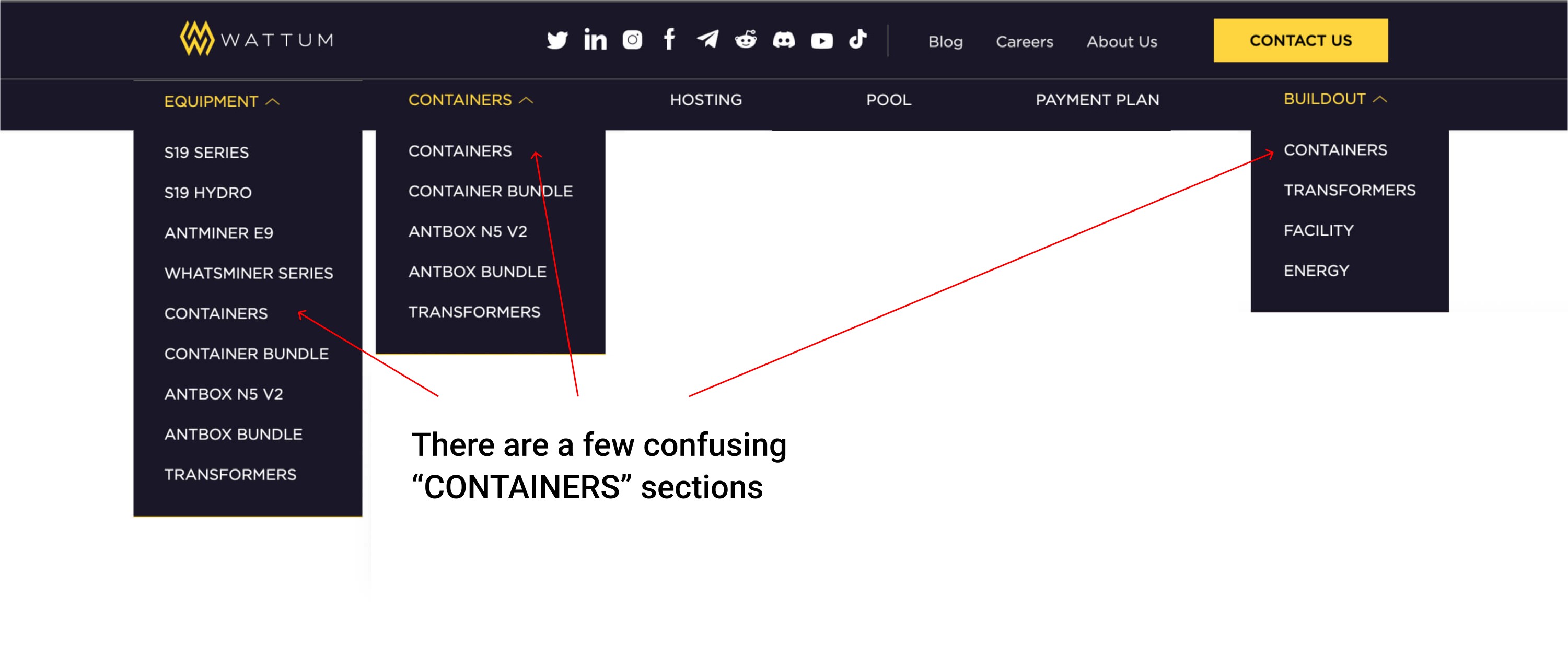
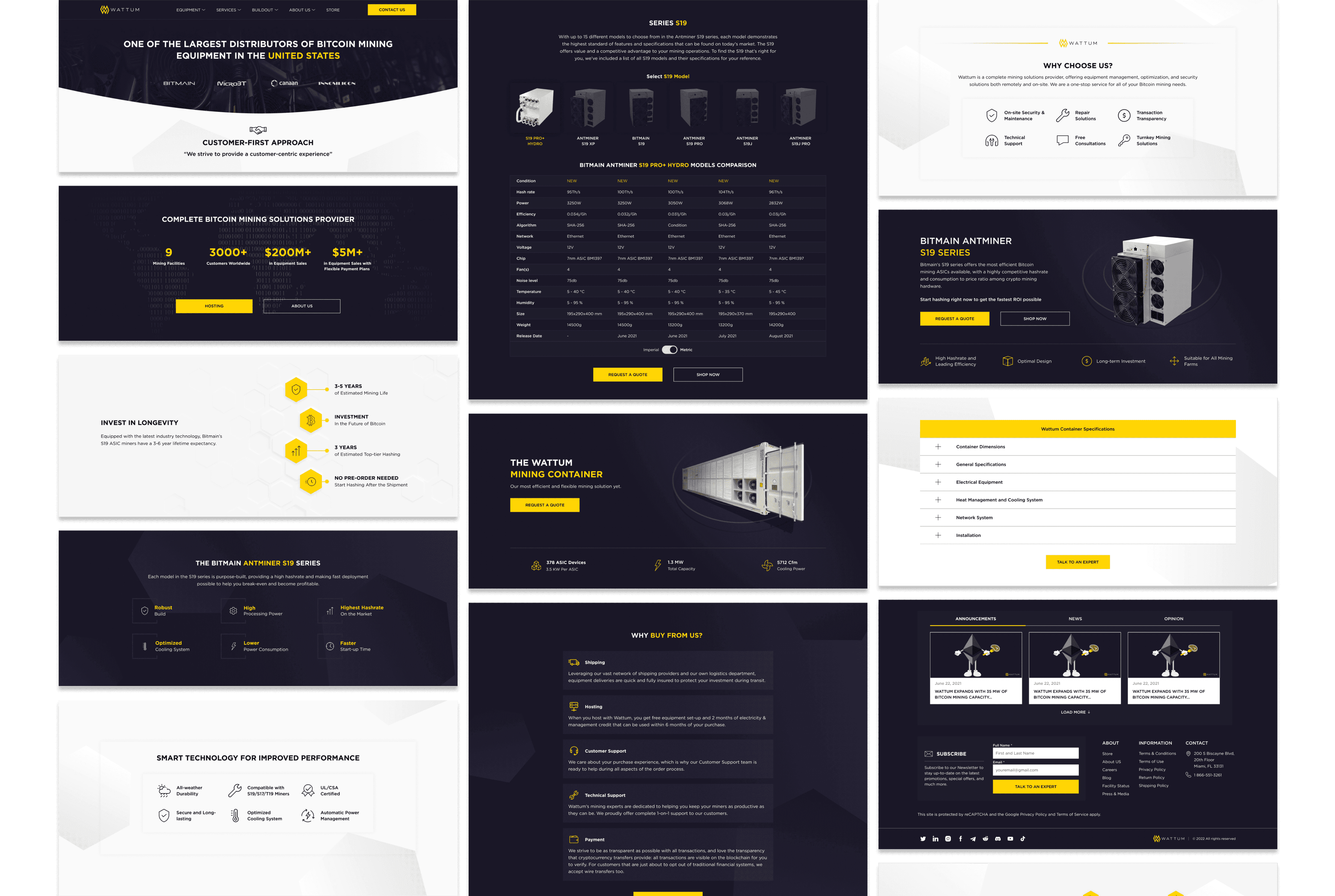
old version
research
Talking with real users
I used multiple methods to gain a deeper understanding of customer pain points and business needs, as well as evaluate user experience and satisfaction with the website. A series of surveys, interviews with stakeholders and users, and A/B usability testing were conducted.
I developed a questionnaire in Google Forms and asked interested parties to participate in the survey. A script for the upcoming series of interviews was also thought out.
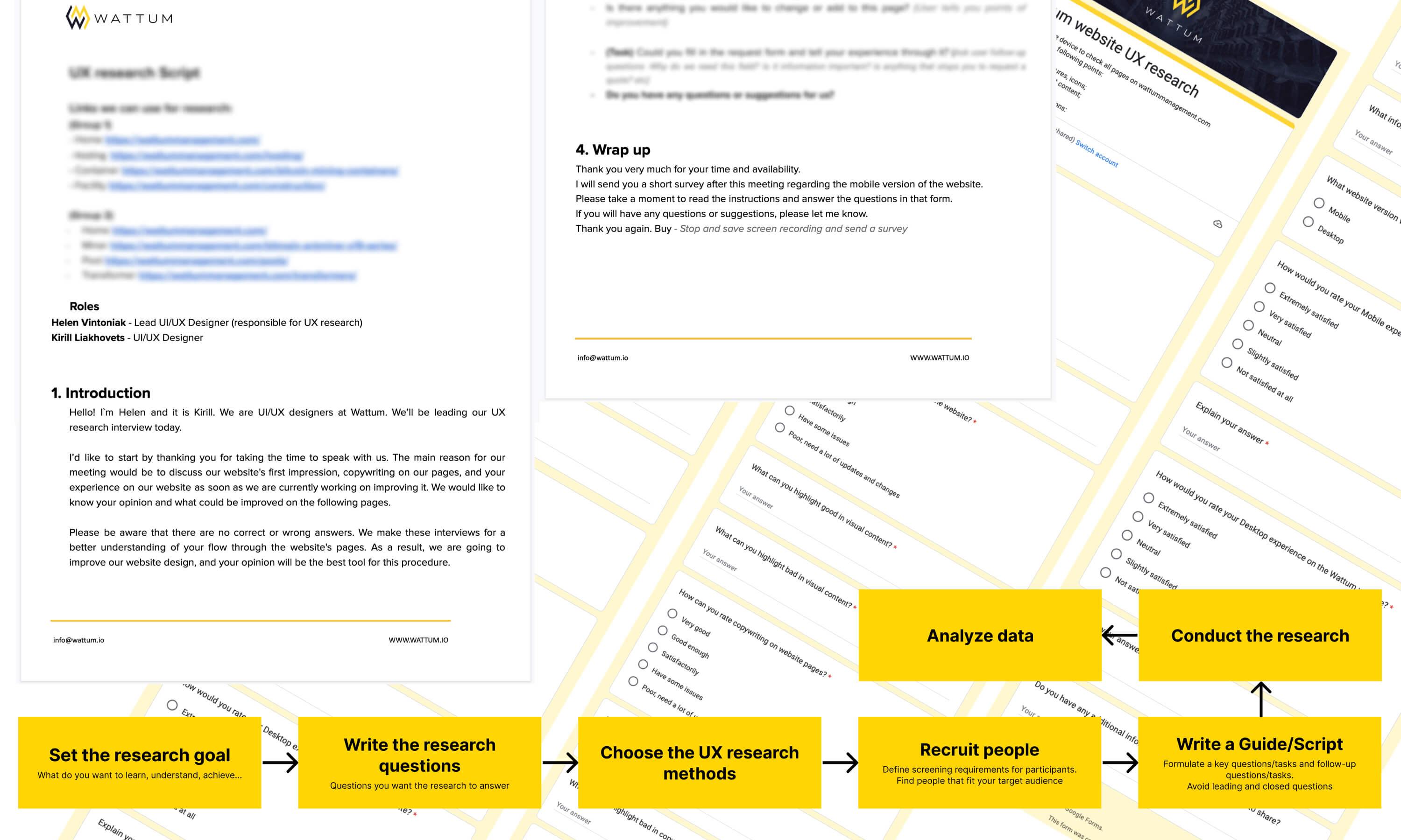
I used Hotjar tool to track user behavior on screen to identify the most problematic areas in the existing user flow.
UX research
The problem statement of information architecture
In the course of the survey results, after the interviews, and after looking at records of user behavior on the site, we discovered some problems that we will work on.
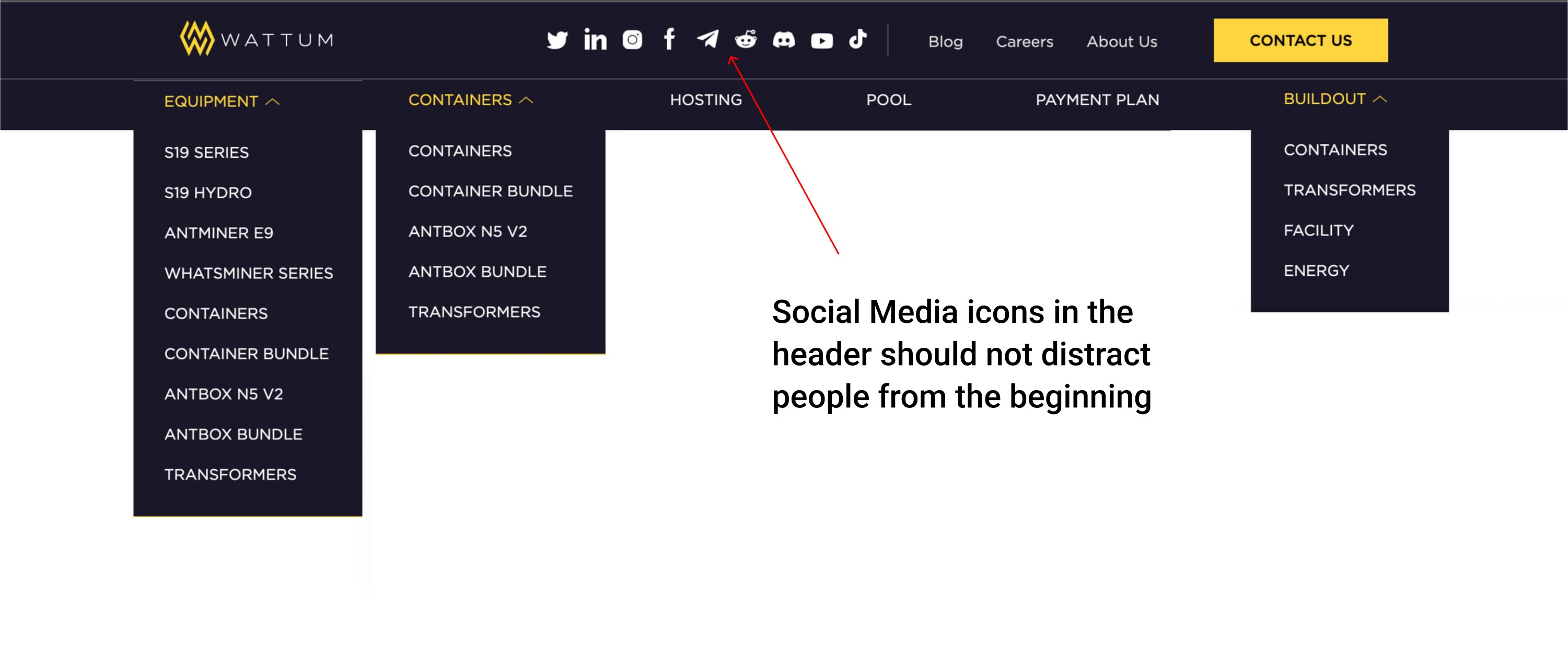
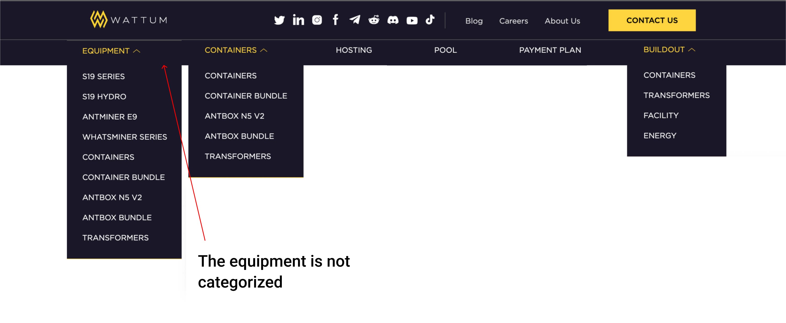
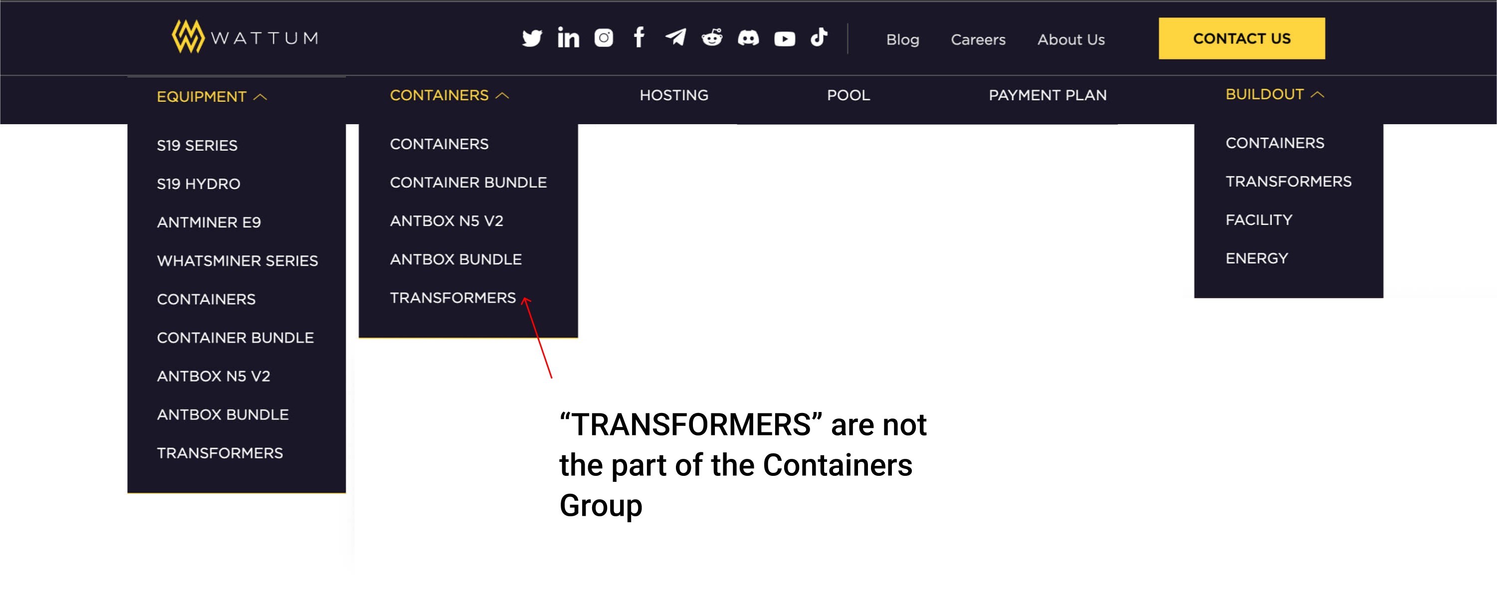
The study found that site navigation was unintuitive and difficult to navigate. To figure this out, we used card sorting.
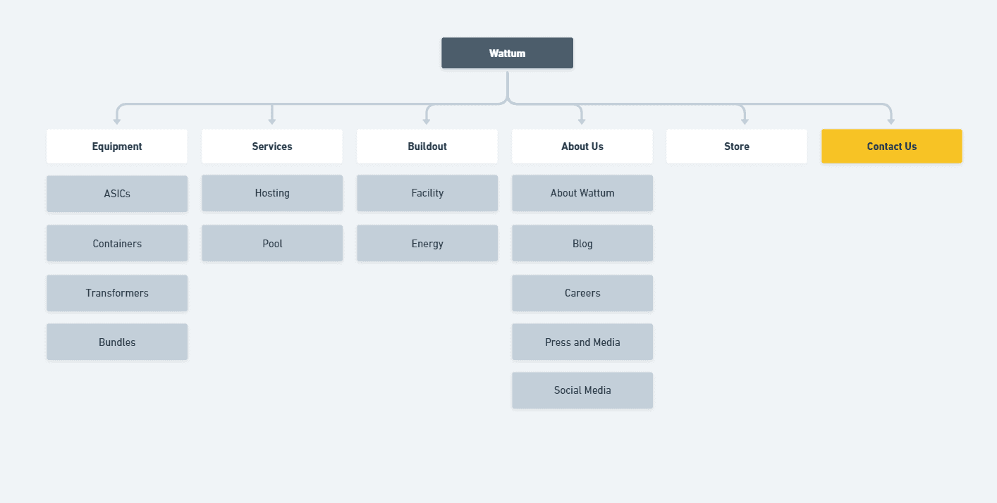
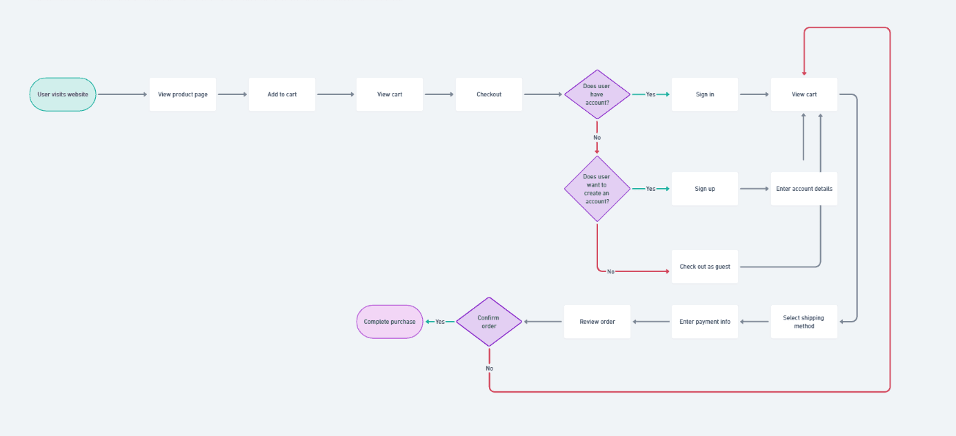
Recreating information architecture. Site mapping
After testing and sorting the cards, we set about developing a new site map. Before implementing it, we came up with our product overhaul for financial tests using an interactive prototype in Figma
New navigation design
After a series of testing of the new navigation, we came to the latest solution, which turned out to be the most convenient and intuitive for the user.
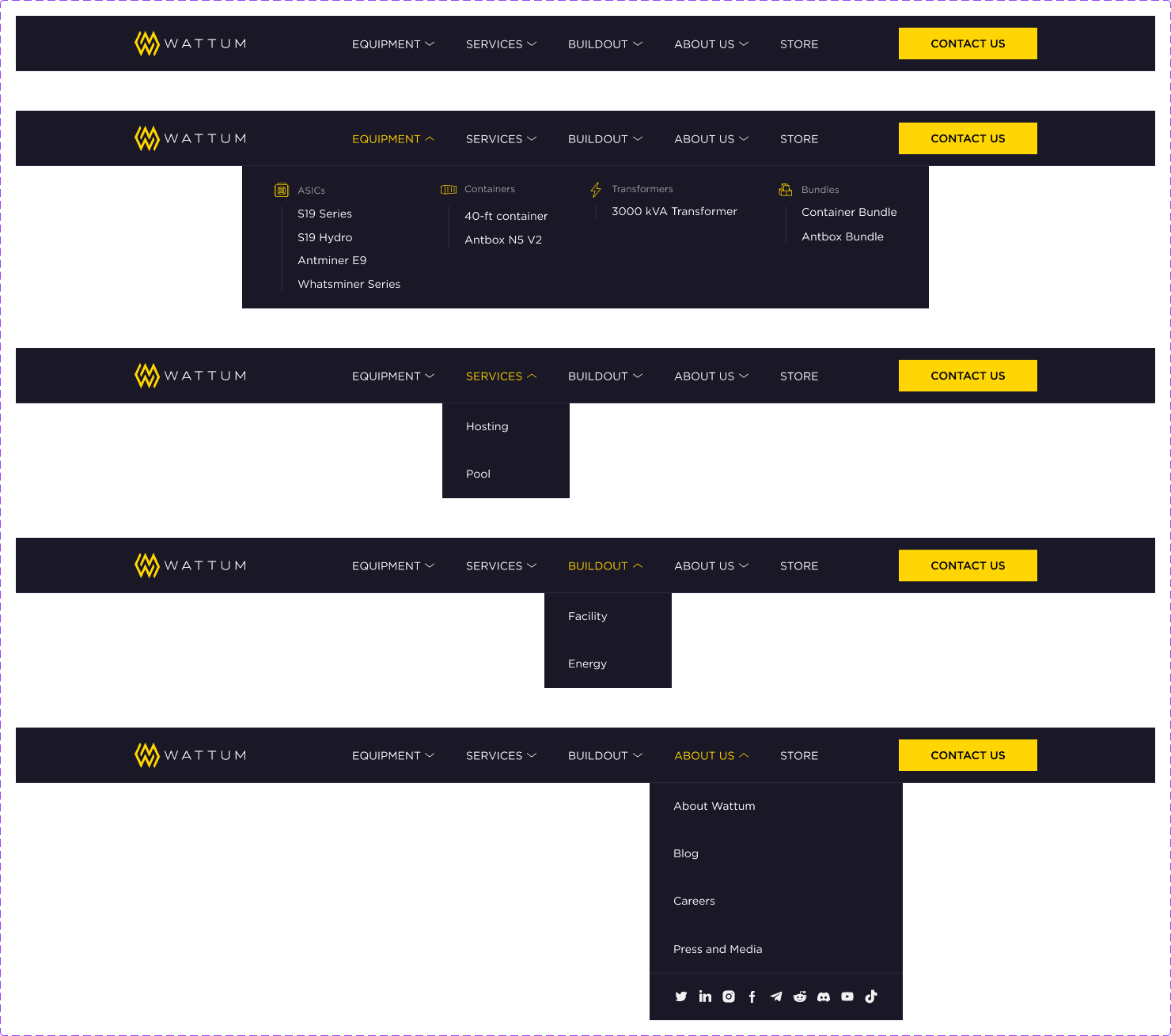
new version
Storytelling
From company's impact to checkout
There are countless crypto companies that offer mining solutions, but very few companies have the same impact as Wattum. We specifically set out to create high-quality original photo content that would give clients an understanding of a serious approach.
Before I joined the project, the checkout process had already been working for some time. Stakeholders asked to understand the performance of user flow.
Users' problem statement
We analyzed user behavior during the checkout process and analyzed data from questionnaires and identified the following points of view for our users.
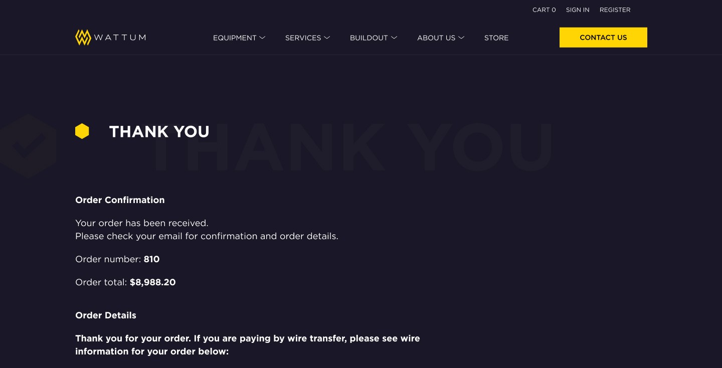
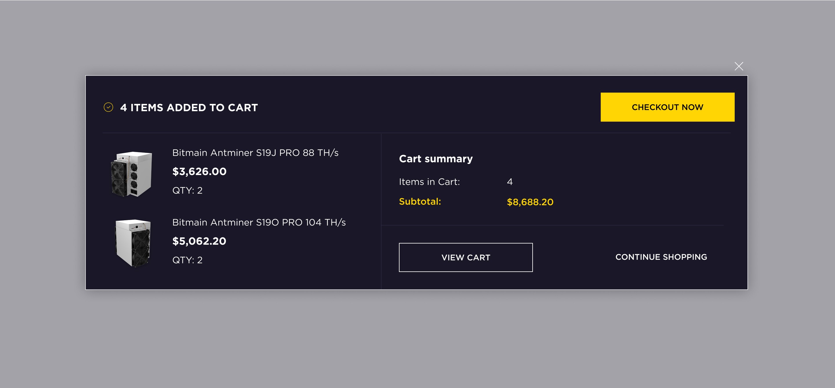
Lack of Progress Indicators
Mistake: Failing to show users where they are in the checkout process. All step indicators were differently colored.
Solution: We designed a progress bar with a steps indicator to inform users of their current steps and overall progress.
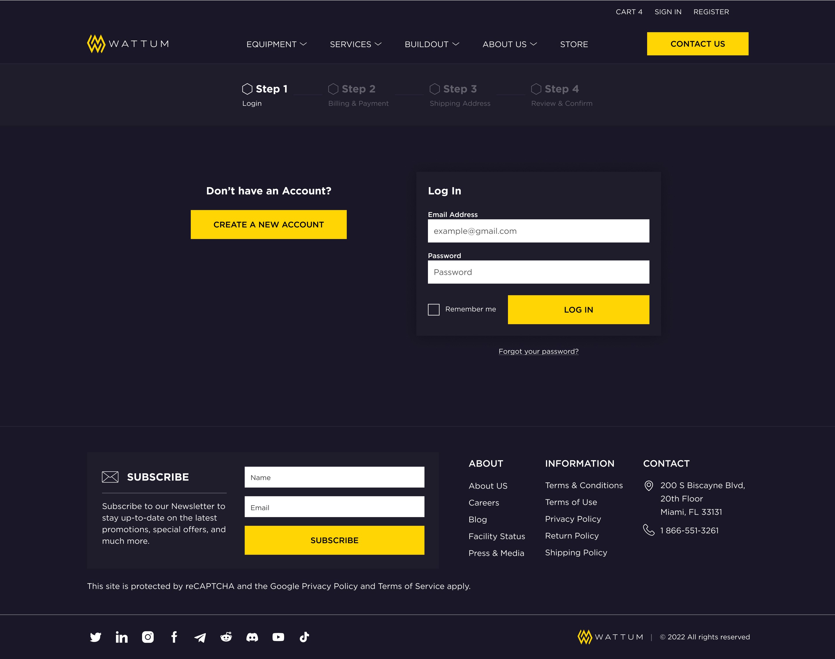
No option to take a step back
Mistake: There was no option to take a step back at some stages of the checkout process.
Solution: We added the option to make a step back by clicking the appropriate button or the step in the progress indicator.
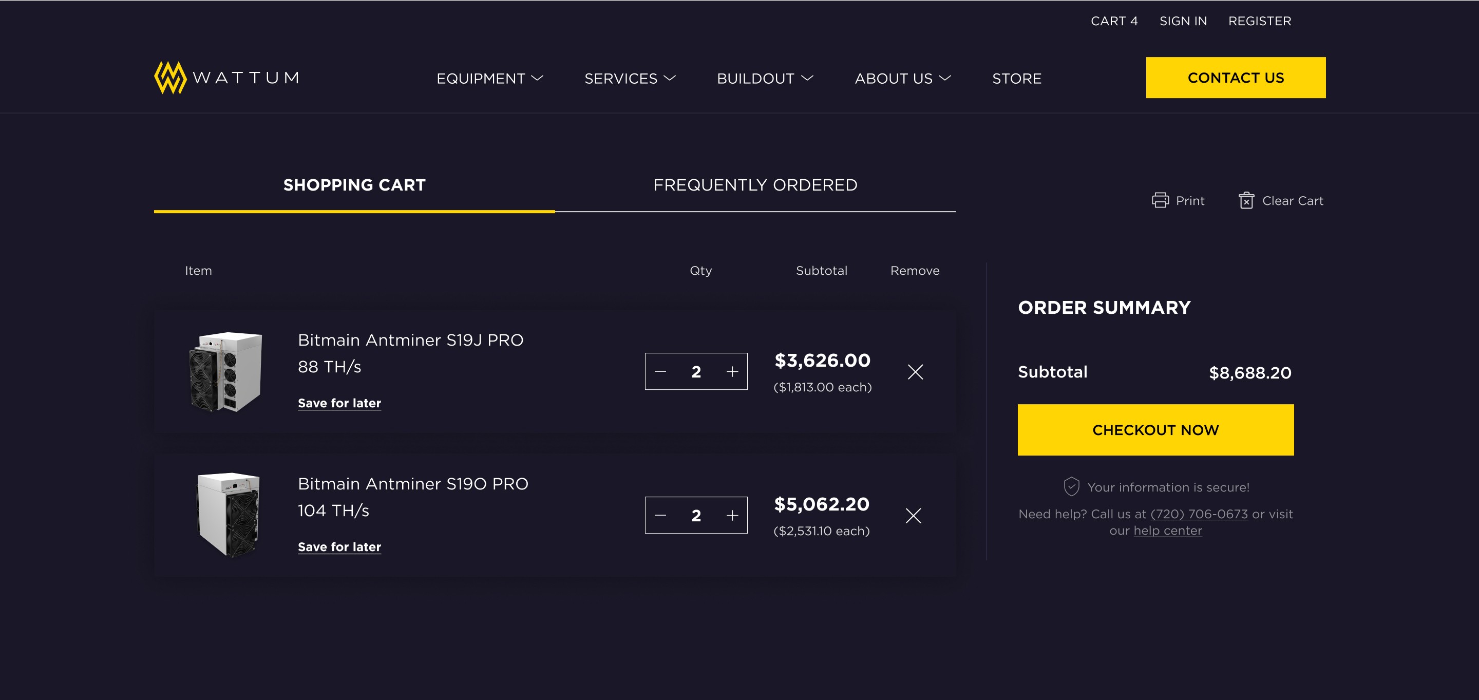
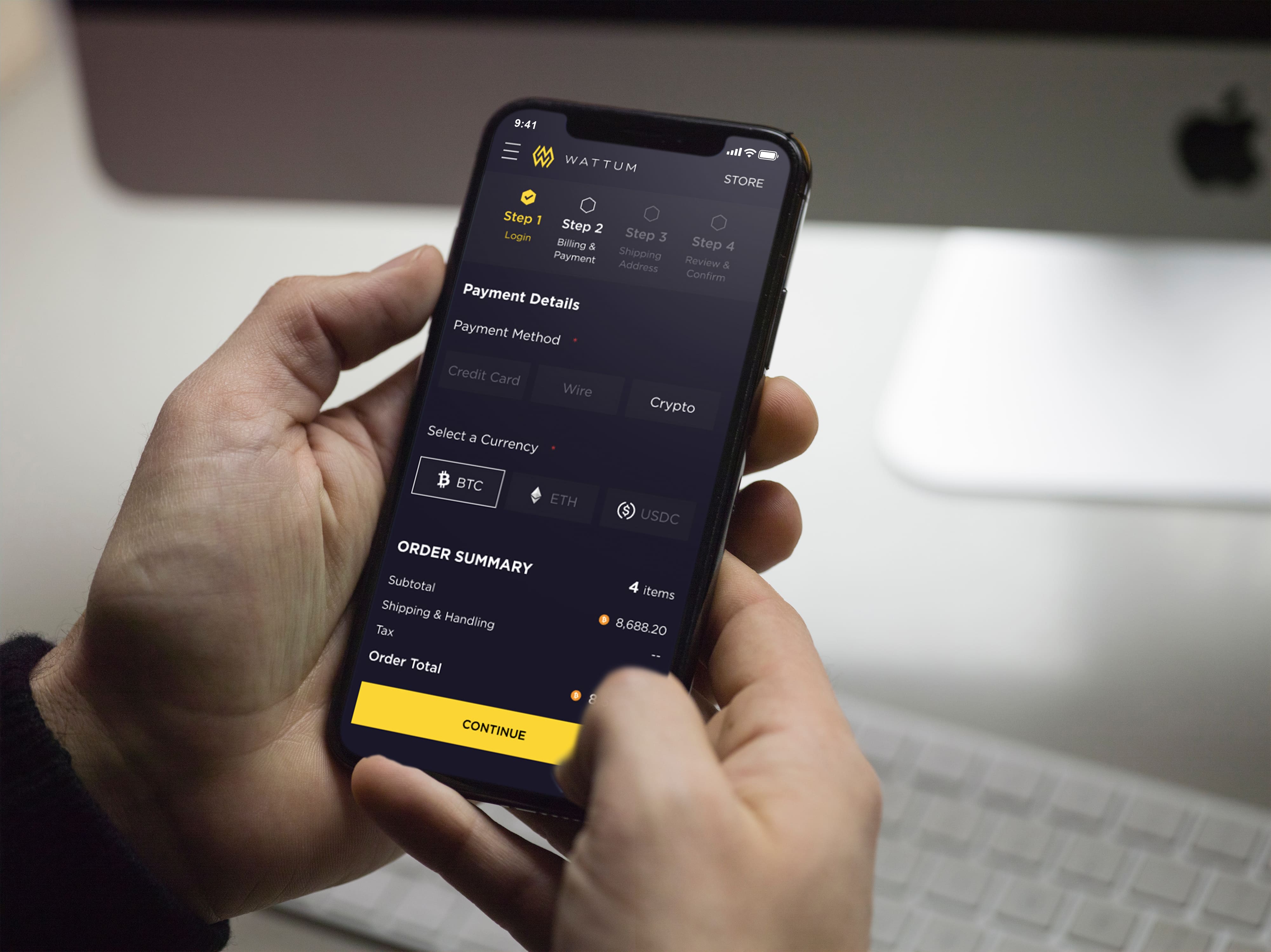
Limited payment options
Mistake: Offering a limited selection of payment methods.
Solution: We asked our stakeholders for the other possible payment methods. As a result, we included one more crypto payment option to accommodate a broader range of users.
Non-mobile design
Mistake: Neglecting the convenience of the mobile user during checkout.
Solution: We redesigned a tablet and mobile version of the checkout screens.


Strategy
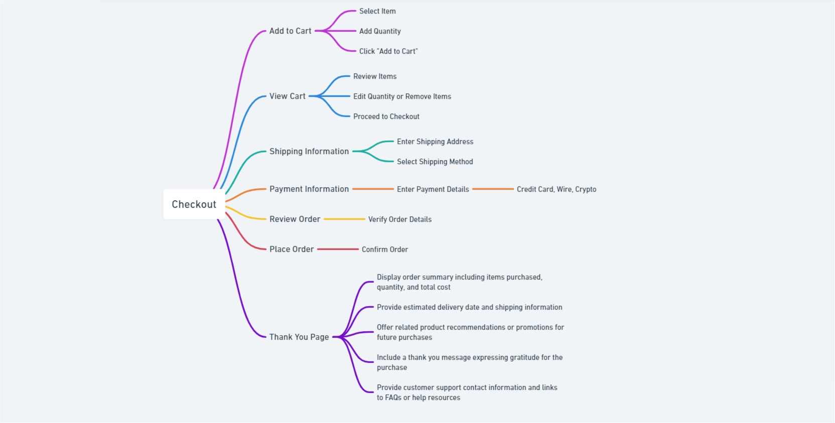
Mind mapping
We used a mind map principle, which allowed us to visually organize the hierarchy of information. We used the checkout process as the core of the process, and from it, we depicted all the necessary steps that the user sees on his screen. Also, the mind map helped us better convey the idea of reworking the checkout process to stakeholders. And this, in turn, could better visualize the stages of the updated checkout.
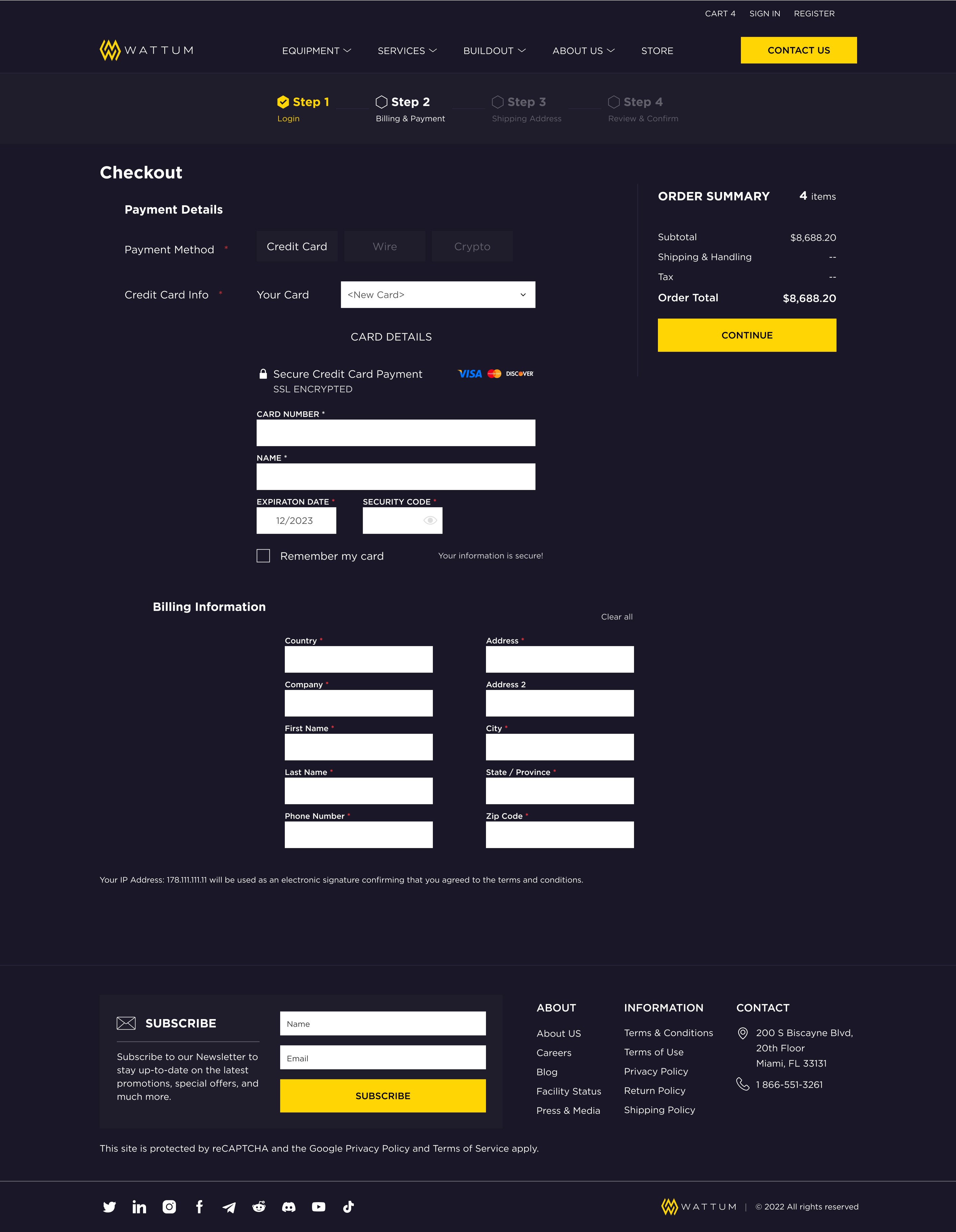
UX Design
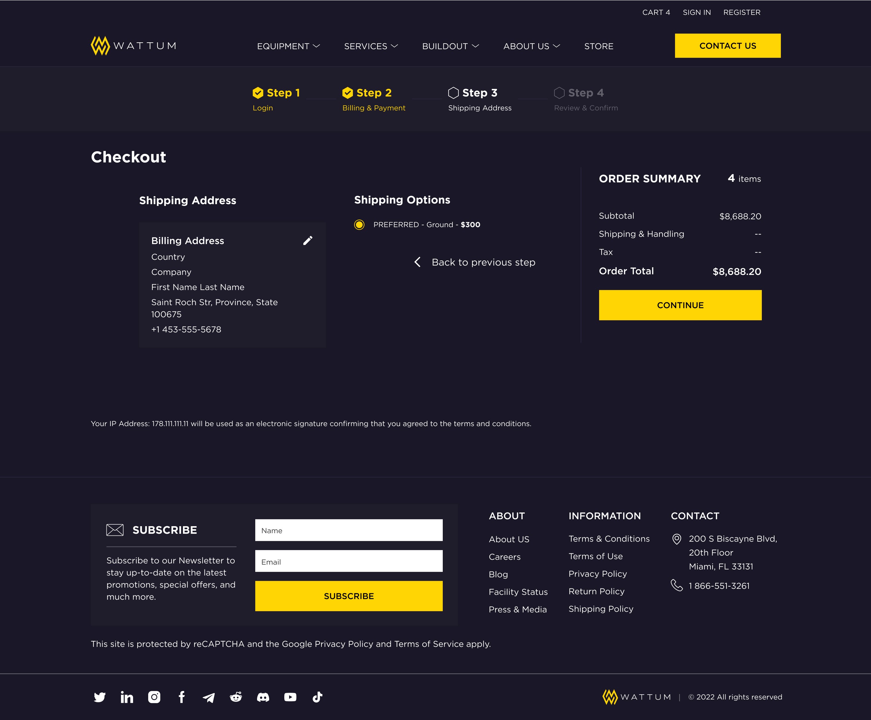
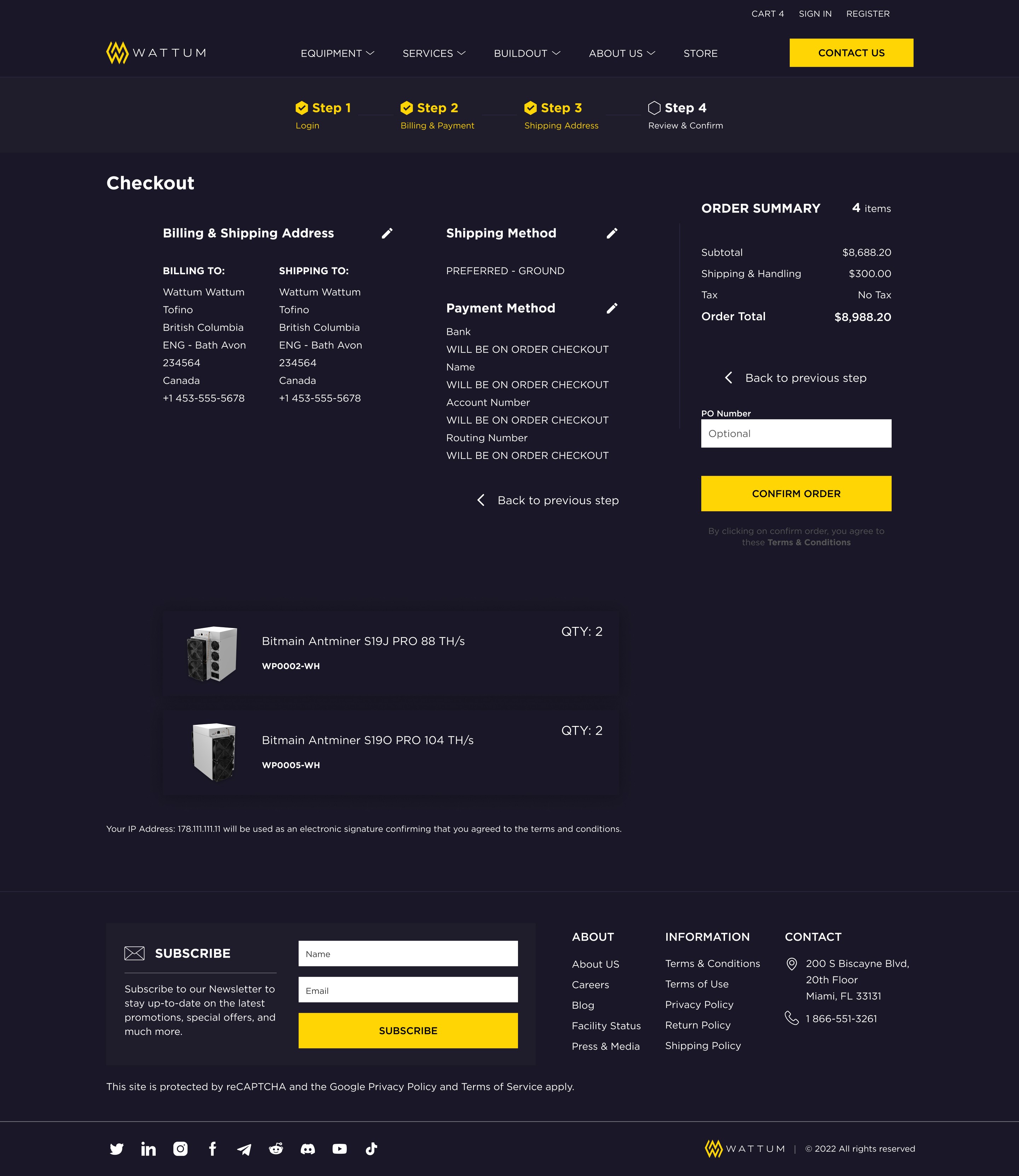
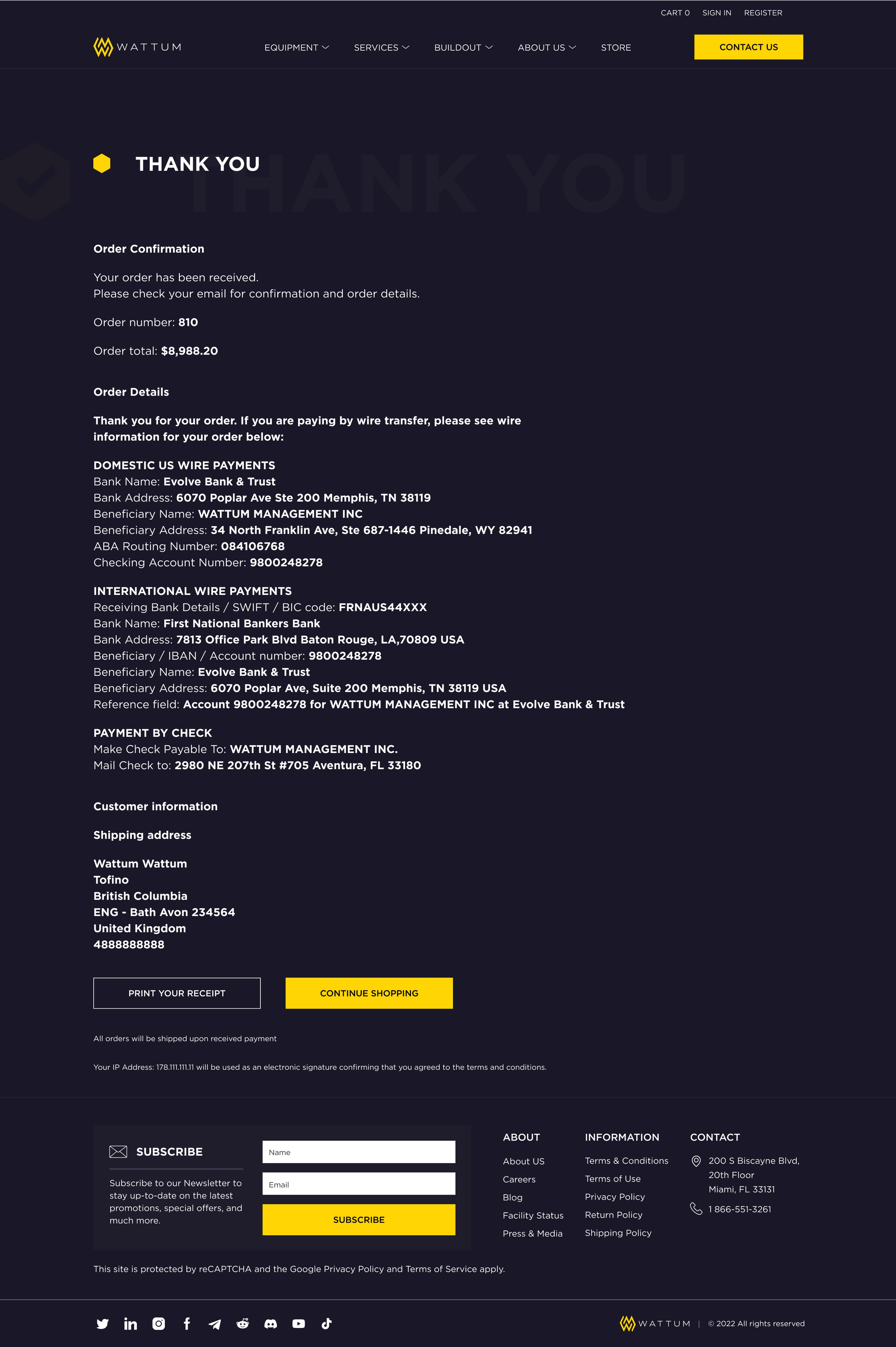
Final design of checkout
At the wireframes stage, I conveyed the structure of the future site and the placement of future content. Until this time, having no idea about the visual part of the site, it was easier for the product owner to perceive the flow of information and the architecture of the site.
UX/Ui Strategy
Benefit from design system
As I mentioned at the beginning, when I joined the team, the site was already live and bringing new clients into the business. However, as with any product, there are always problem areas that need to be focused on shortly.
In my role on the team, I helped improve the site's visual elements, and website blocks and created new pages. But the fact is that the company did not have a design system that all designers could use. There was a guideline and a brand book, but there was no design system.
I decided to take on this task and created an atomic design system in Figma.
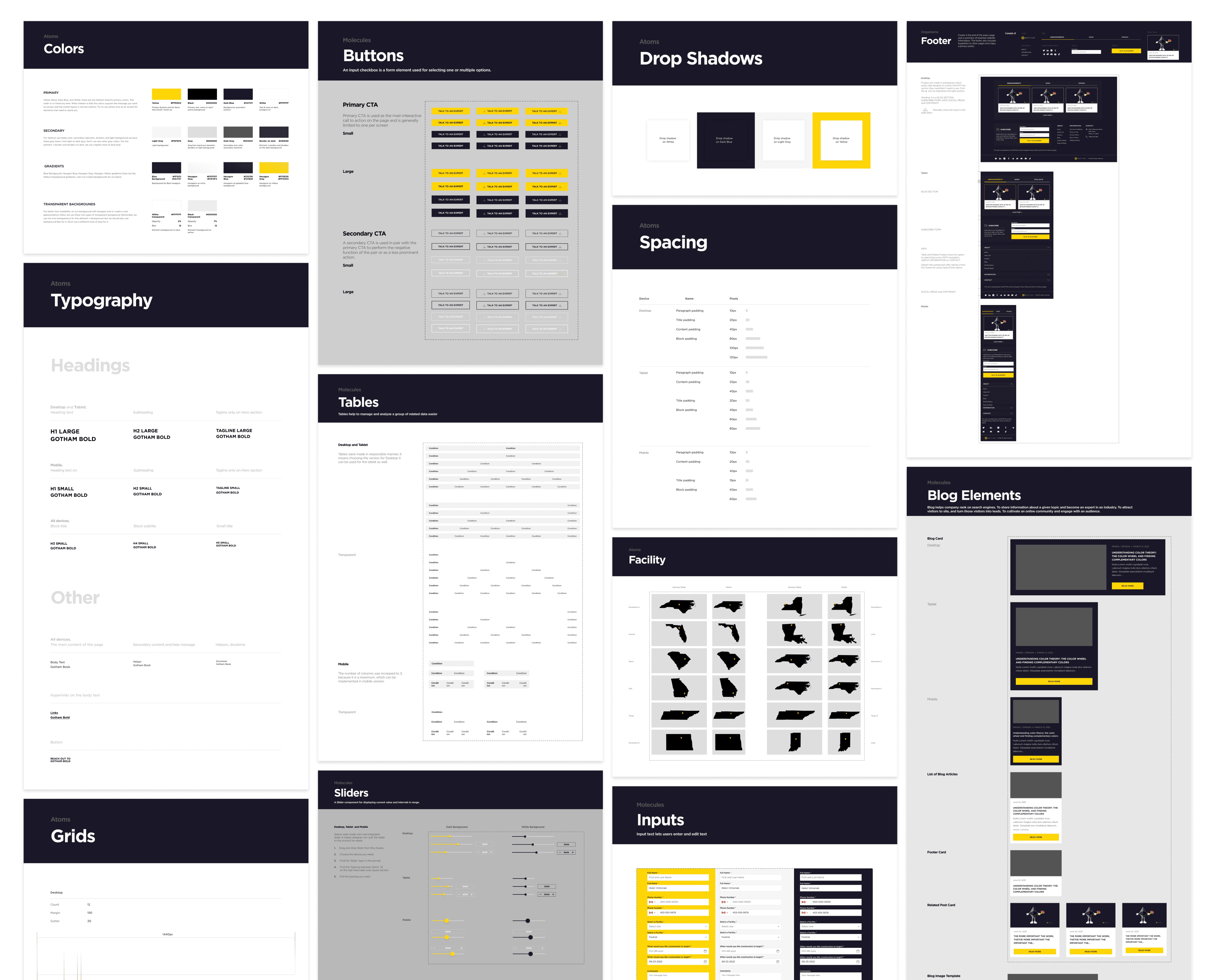
By creating a design system and integrating it into all working documents of the project in Figma, we were able to reduce the time for creating new pages, as well as developing email campaigns, by more than 40%.
learnings
Key takeaways
Having carried out work on the Wattum company project, we managed to achieve better results. So, by analyzing the information we collected and talking with real users of the existing website, we were able to improve the digital experience for customers.
1. One of the most significant results was the reworking of the current site navigation by rethinking the user flow. We created a site map for which we redesigned the navigation. This led to an increase in orders for user consultations by 30%.
2. We redesigned the checkout process taking into account user pain points. We made the process indicators more informative with the ability to return to the previous step, added another payment method, and redesigned the mobile version of checkout. This led to a better response from users during checkout and made their flow more targeted towards the final checkout.
3. I also created an atomic design system for the project, which helped speed up the creation of additional website pages and emails by up to 40%
My contributions to the Wattum project allowed me to improve my leadership and UX/UX design skills and helped me positively impact brand awareness, crypto business growth, and company revenue.
background
Increasing client conversion amid falling Bitcoin
Wattum is the world's leading crypto mining equipment distributor and complete mining solutions provider based out of the United States. The company already had a stream of clients and big players in the market. However, it was revealed that site users moved around the site quite chaotically and issues arose with the checkout process. Product Owner asked to work and improve the above processes. We (including myself, other designers, developers, product managers) started by analyzing competitors and identifying their strengths.
The challenge
Increase the percentage of converting a client into a customer at the time of a big fall in Bitcoin to increase sales and market share. And also develop a design system to be ready to create new pages of an existing site faster.
old version
research
Talking with real users
I used multiple methods to gain a deeper understanding of customer pain points and business needs, as well as evaluate user experience and satisfaction with the website. A series of surveys, interviews with stakeholders and users, and A/B usability testing were conducted.
I developed a questionnaire in Google Forms and asked interested parties to participate in the survey. A script for the upcoming series of interviews was also thought out.
I used Hotjar tool to track user behavior on screen to identify the most problematic areas in the existing user flow.
UX research
The problem statement of information architecture
In the course of the survey results, after the interviews, and after looking at records of user behavior on the site, we discovered some problems that we will work on.
The study found that site navigation was unintuitive and difficult to navigate. To figure this out, we used card sorting.
Recreating information architecture. Site mapping
After testing and sorting the cards, we set about developing a new site map. Before implementing it, we came up with our product overhaul for financial tests using an interactive prototype in Figma
New navigation design
After a series of testing of the new navigation, we came to the latest solution, which turned out to be the most convenient and intuitive for the user.
Storytelling
From company's impact to checkout
There are countless crypto companies that offer mining solutions, but very few companies have the same impact as Wattum. We specifically set out to create high-quality original photo content that would give clients an understanding of a serious approach.
Before I joined the project, the checkout process had already been working for some time. Stakeholders asked to understand the performance of user flow.
Users' problem statement
We analyzed user behavior during the checkout process and analyzed data from questionnaires and identified the following points of view for our users.
Lack of Progress Indicators
Mistake: Failing to show users where they are in the checkout process. All step indicators were differently colored.
Solution: We designed a progress bar with a steps indicator to inform users of their current steps and overall progress.
No option to take a step back
Mistake: There was no option to take a step back at some stages of the checkout process.
Solution: We added the option to make a step back by clicking the appropriate button or the step in the progress indicator.
Limited payment options
Mistake: Offering a limited selection of payment methods.
Solution: We asked our stakeholders for the other possible payment methods. As a result, we included one more crypto payment option to accommodate a broader range of users.
Non-mobile design
Mistake: Neglecting the convenience of the mobile user during checkout.
Solution: We redesigned a tablet and mobile version of the checkout screens.
Strategy
Mind mapping
We used a mind map principle, which allowed us to visually organize the hierarchy of information. We used the checkout process as the core of the process, and from it, we depicted all the necessary steps that the user sees on his screen. Also, the mind map helped us better convey the idea of reworking the checkout process to stakeholders. And this, in turn, could better visualize the stages of the updated checkout.
UX Design
Final design of checkout
At the wireframes stage, I conveyed the structure of the future site and the placement of future content. Until this time, having no idea about the visual part of the site, it was easier for the product owner to perceive the flow of information and the architecture of the site.
UX/Ui Strategy
Benefit from design system
As I mentioned at the beginning, when I joined the team, the site was already live and bringing new clients into the business. However, as with any product, there are always problem areas that need to be focused on shortly.
In my role on the team, I helped improve the site's visual elements, and website blocks and created new pages. But the fact is that the company did not have a design system that all designers could use. There was a guideline and a brand book, but there was no design system.
I decided to take on this task and created an atomic design system in Figma.
By creating a design system and integrating it into all working documents of the project in Figma, we were able to reduce the time for creating new pages, as well as developing email campaigns, by more than 40%.
learnings
Key takeaways
Having carried out work on the Wattum company project, we managed to achieve better results. So, by analyzing the information we collected and talking with real users of the existing website, we were able to improve the digital experience for customers.
1. One of the most significant results was the reworking of the current site navigation by rethinking the user flow. We created a site map for which we redesigned the navigation. This led to an increase in orders for user consultations by 30%.
2. We redesigned the checkout process taking into account user pain points. We made the process indicators more informative with the ability to return to the previous step, added another payment method, and redesigned the mobile version of checkout. This led to a better response from users during checkout and made their flow more targeted towards the final checkout.
3. I also created an atomic design system for the project, which helped speed up the creation of additional website pages and emails by up to 40%
My contributions to the Wattum project allowed me to improve my leadership and UX/UX design skills and helped me positively impact brand awareness, crypto business growth, and company revenue.
new version
background
Increasing client conversion amid falling Bitcoin
Wattum is the world's leading crypto mining equipment distributor and complete mining solutions provider based out of the United States. The company already had a stream of clients and big players in the market. However, it was revealed that site users moved around the site quite chaotically and issues arose with the checkout process. Product Owner asked to work and improve the above processes. We (including myself, other designers, developers, product managers) started by analyzing competitors and identifying their strengths.
The challenge
Increase the percentage of converting a client into a customer at the time of a big fall in Bitcoin in order to increase sales and market share. And also develop a design system to be ready to create new pages of an existing site with greater speed.
old version
research
Talking with real users
I used multiple methods to gain a deeper understanding of customer pain points and business needs, as well as evaluate user experience and satisfaction with the website. A series of surveys, interviews with stakeholders and users, and A/B usability testing were conducted.
I developed a questionnaire in Google Forms and asked interested parties to participate in the survey. A script for the upcoming series of interviews was also thought out.
I used Hotjar tool to track user behavior on screen to identify the most problematic areas in the existing user flow.
UX research
The problem statement of information architecture
In the course of the survey results, after the interviews, and after looking at records of user behavior on the site, we discovered some problems that we will work on.
The study found that site navigation was unintuitive and difficult to navigate. To figure this out, we used card sorting.
Recreating information architecture. Site mapping
After testing and sorting the cards, we set about developing a new site map. Before implementing it, we came up with our product overhaul for financial tests using an interactive prototype in Figma
New navigation design
After a series of testing of the new navigation, we came to the latest solution, which turned out to be the most convenient and intuitive for the user.
Storytelling
From company's impact to checkout
There are countless crypto companies that offer mining solutions, but very few companies have the same impact as Wattum. We specifically set out to create high-quality original photo content that would give clients an understanding of a serious approach.
Before I joined the project, the checkout process had already been working for some time. Stakeholders asked to understand the performance of user flow.
Users' problem statement
We analyzed user behavior during the checkout process and analyzed data from questionnaires and identified the following points of view for our users.
Lack of Progress Indicators
Mistake: Failing to show users where they are in the checkout process. All step indicators were differently colored.
Solution: We designed a progress bar with a steps indicator to inform users of their current steps and overall progress.
No option to take a step back
Mistake: There was no option to take a step back at some stages of the checkout process.
Solution: We added the option to make a step back by clicking the appropriate button or the step in the progress indicator.
Limited payment options
Mistake: Offering a limited selection of payment methods.
Solution: We asked our stakeholders for the other possible payment methods. As a result, we included one more crypto payment option to accommodate a broader range of users.
Non-mobile design
Mistake: Neglecting the convenience of the mobile user during checkout.
Solution: We redesigned a tablet and mobile version of the checkout screens.
Strategy
Mind mapping
We used a mind map principle, which allowed us to visually organize the hierarchy of information. We used the checkout process as the core of the process, and from it, we depicted all the necessary steps that the user sees on his screen. Also, the mind map helped us better convey the idea of reworking the checkout process to stakeholders. And this, in turn, could better visualize the stages of the updated checkout.
Final design of checkout
At the wireframes stage, I conveyed the structure of the future site and the placement of future content. Until this time, having no idea about the visual part of the site, it was easier for the product owner to perceive the flow of information and the architecture of the site.
UX/Ui Strategy
Benefit from design system
As I mentioned at the beginning, when I joined the team, the site was already live and bringing new clients into the business. However, as with any product, there are always problem areas that need to be focused on shortly.
In my role on the team, I helped improve the site's visual elements, and website blocks and created new pages. But the fact is that the company did not have a design system that all designers could use. There was a guideline and a brand book, but there was no design system.
I decided to take on this task and created an atomic design system in Figma.
By creating a design system and integrating it into all working documents of the project in Figma, we were able to reduce the time for creating new pages, as well as developing email campaigns, by more than 40%.
Key takeaways
Having carried out work on the Wattum company project, we managed to achieve better results. So, by analyzing the information we collected and talking with real users of the existing website, we were able to improve the digital experience for customers.
1. One of the most significant results was the reworking of the current site navigation by rethinking the user flow. We created a site map for which we redesigned the navigation. This led to an increase in orders for user consultations by 30%.
2. We redesigned the checkout process taking into account user pain points. We made the process indicators more informative with the ability to return to the previous step, added another payment method, and redesigned the mobile version of checkout. This led to a better response from users during checkout and made their flow more targeted towards the final checkout.
3. I also created an atomic design system for the project, which helped speed up the creation of additional website pages and emails by up to 40%
My contributions to the Wattum project allowed me to improve my leadership and UX/UX design skills and helped me positively impact brand awareness, crypto business growth, and company revenue.
new version