background
Project background
Visual language is like any other language. Miscommunication happens when everyone needs to share and understand it. As a product and its team grow, misunderstandings become more common. Design is always about systems and building products in a scalable and repeatable way.
When I joined the project, the company only had recently written guidelines. A design system did not exist.
Process
Getting ready to work
To address this challenge and speed up decision-making, I gathered a small team of designers.
Here is the answer to the mostly asked question “Who does system design?”. The short answer is “Designers”. UX or UI — this question I would address to the heads of design teams in each company.
I cleared my schedule, set aside time, and focused on creating the company’s first design system.
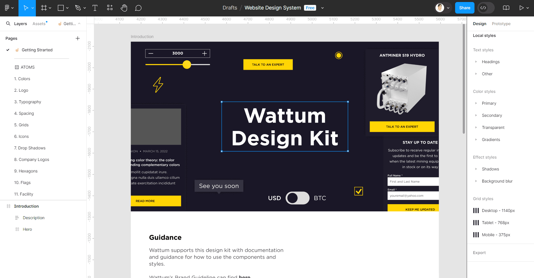
Our goal for the design system was to create a consistent, attractive, and accessible design language. We wanted our projects to be unified platforms that increase efficiency with clear and reusable components. To focus, I limited the initial work to the website, including desktop, mobile, and tablet versions.
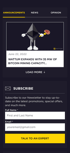
We began by auditing all the website pages, old and new. By comparing the flows side by side, we identified where the user experience was failing and what changes were needed. To start, I focused on the screens with outdated design elements. This helped us establish a few guiding principles for building the design system:
Universal: Wattum is widely used in the crypto world. Our product and visual language should be welcoming and accessible.
Iconic: We emphasize both design and functionality. Our work should reflect this focus.
Conversational: We aim to infuse our products with energy and communicate with users clearly and understandably.
Laying Down a Pattern
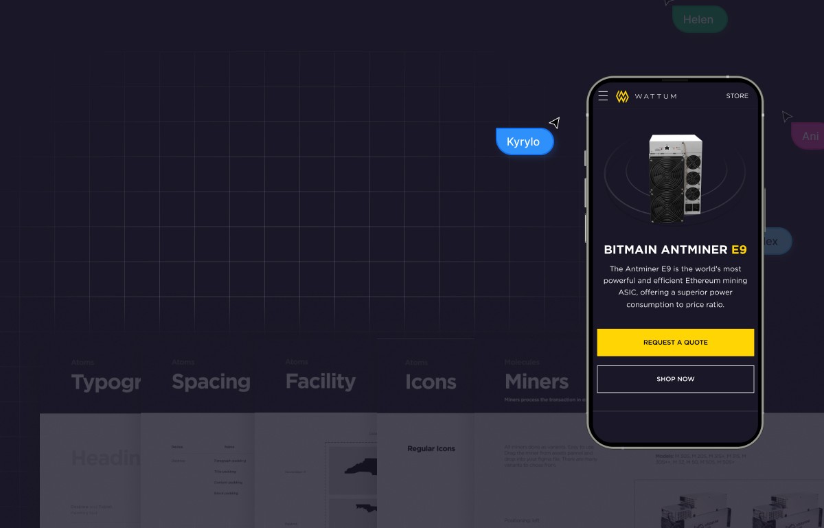
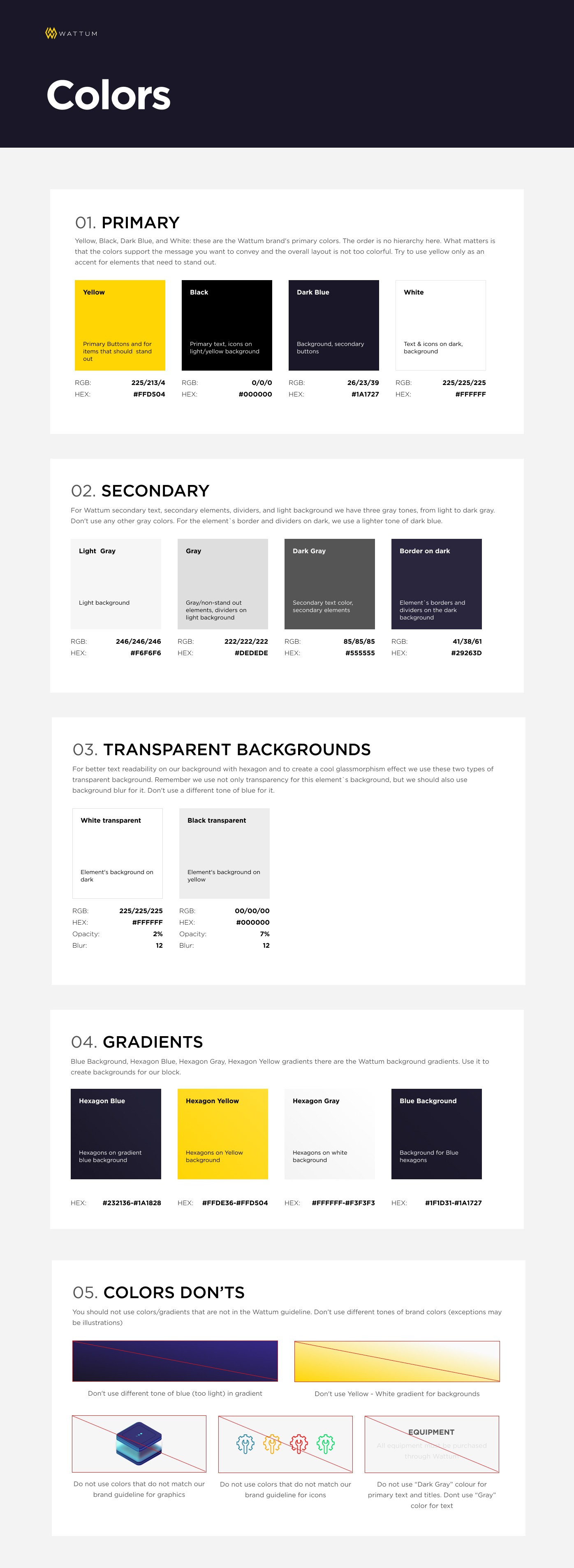
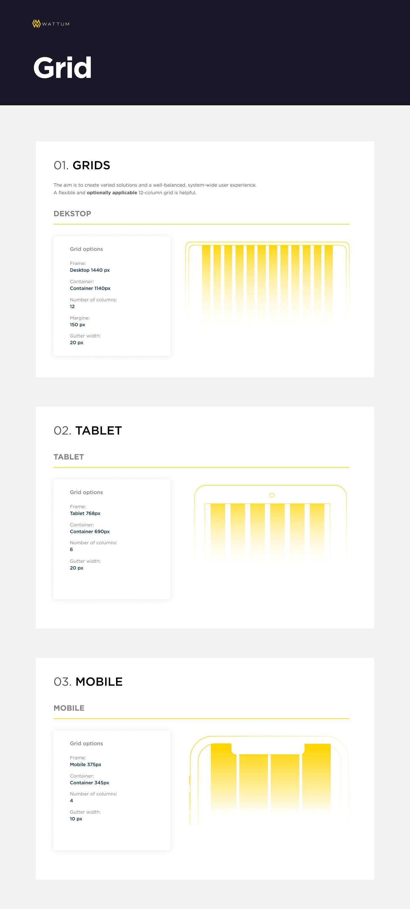
Before the design sprint began, we already had a basic style guide called a foundation. This foundation defined our typography, colors, icons, spacing, and information architecture. It was essential for guiding our work in a unified direction while allowing us to explore creative design solutions individually.
Frankly speaking, I addressed the idea of a “What is design system in Figma” to the project manager.
As I reviewed the work at the end of each day, I noticed patterns emerging.
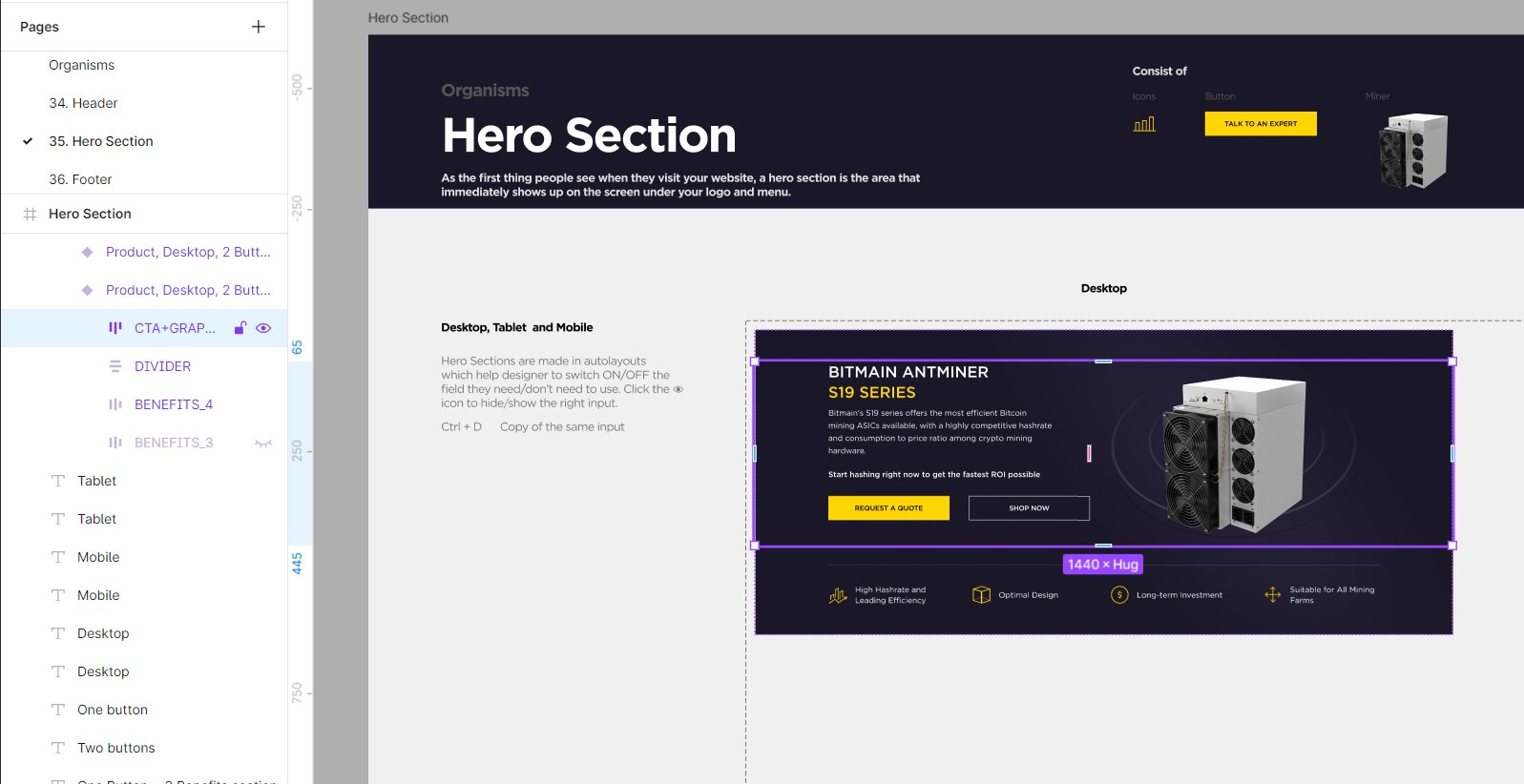
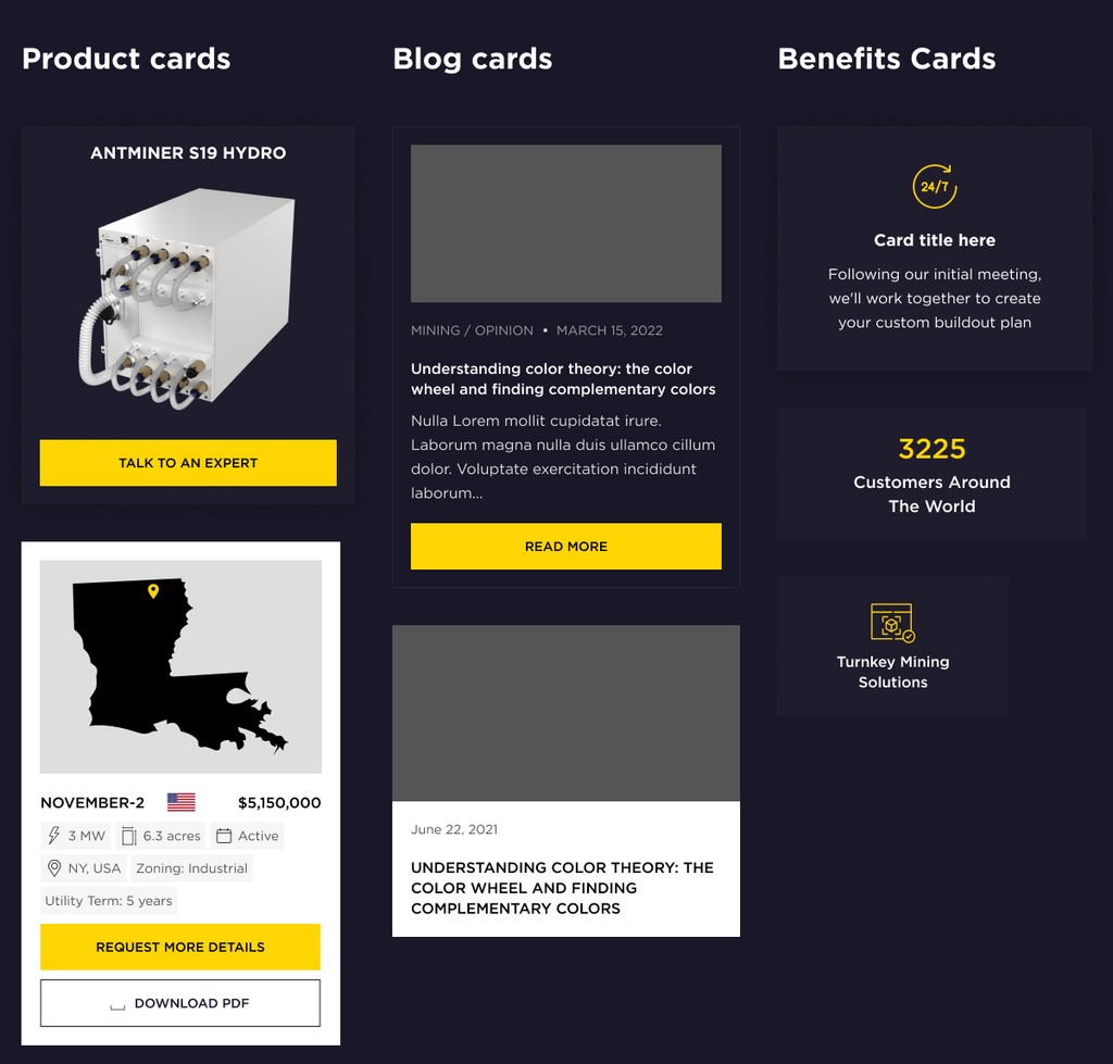
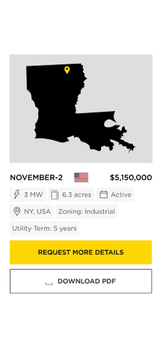
Each component includes required elements like title, text, icon, and image. It may also have optional elements. These elements are specified in the Figma document. We invented every component to have a separator, which can be shown or hidden based on presentation logic, instead of allowing separator lines
Crypto orientation
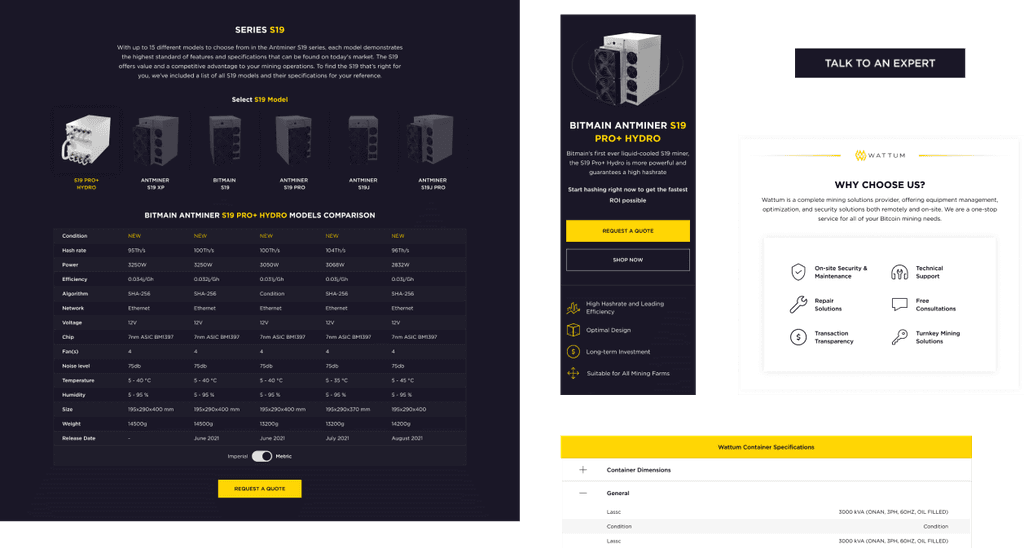
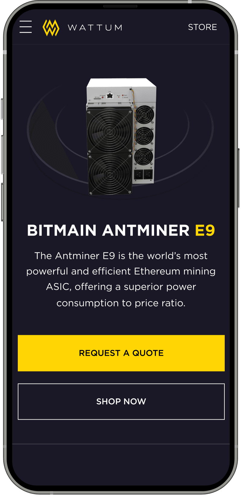
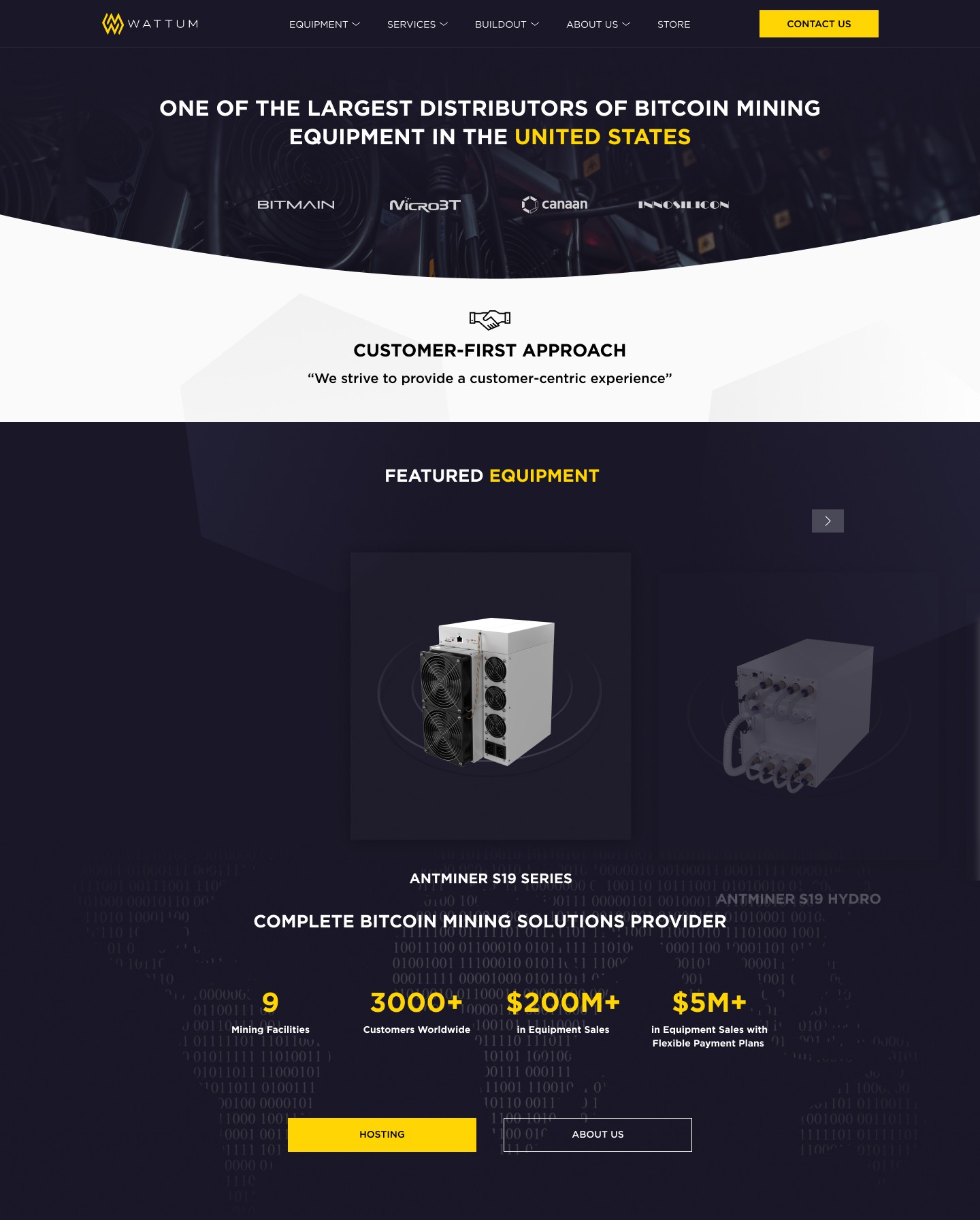
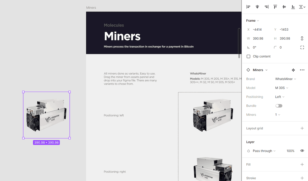
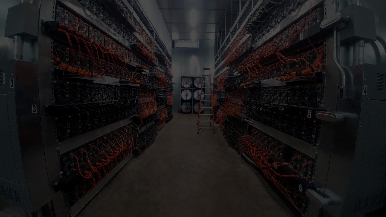
One of the main design features of the system was creating variants for miners. Previously, miner images were poorly used in projects, including emails, presentations, and social media. This affected both image quality and consistency.
I focused on improving the image quality of each miner model and created individual components from them. When developing the system, I considered parameters such as miner brand, model, positioning, kits, and quantity.
This is where tools like Photoshop and Illustrator came in handy. I believe the miner models I worked on and nearly re-drew are the best on the Internet.
Even when processing a large flow of information, details such as positioning relative to actions were important.
Building the library
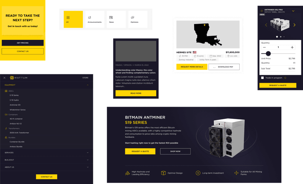
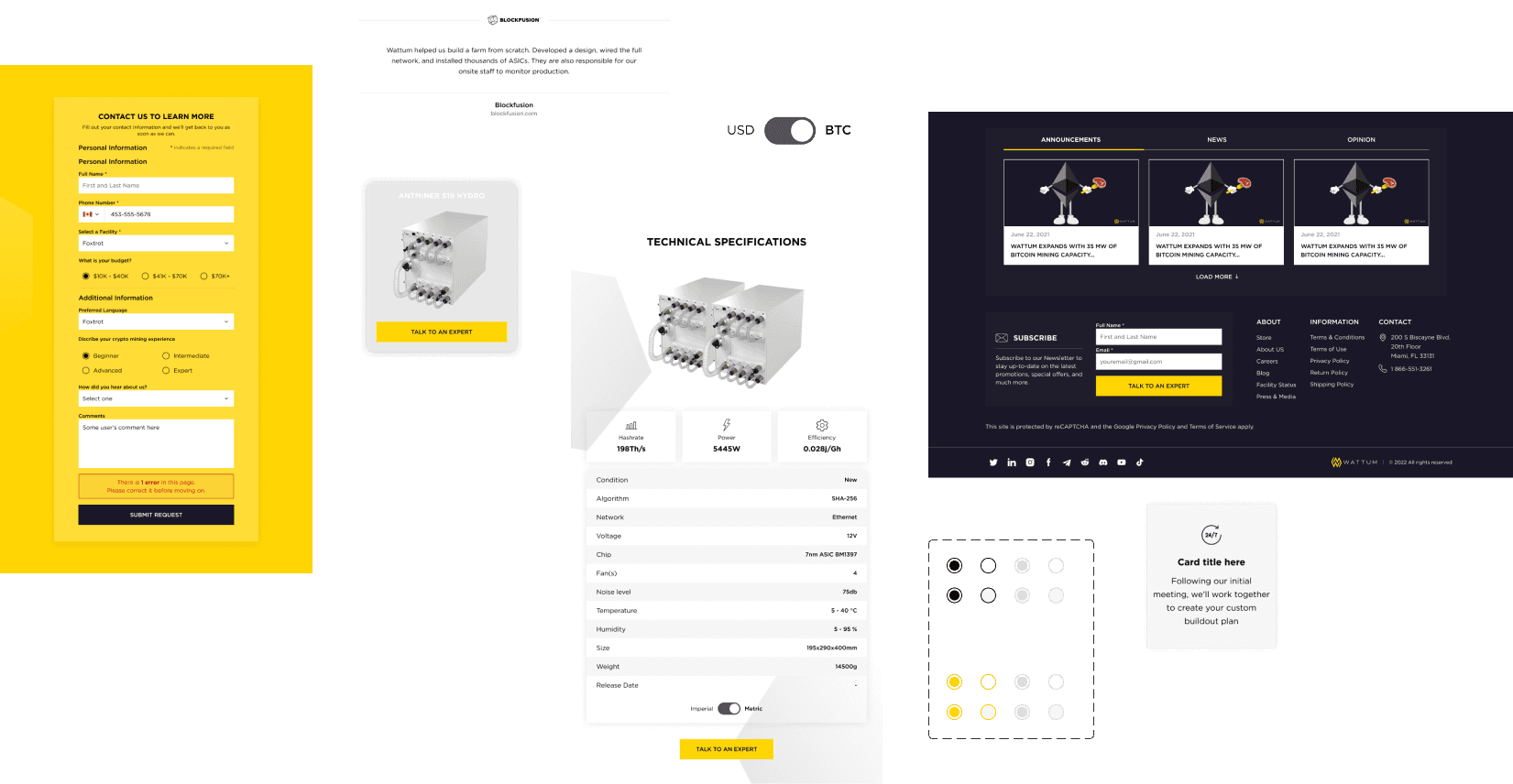
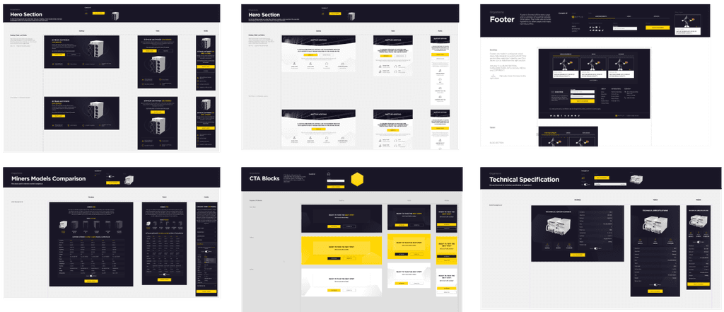
I organized the components into a main file called the library, which we used throughout the page design process. After a few weeks, we noticed a significant performance improvement when iterating on projects using the library. For example, when building a new page for a miner, I created an adaptive page in just a few hours using the library’s structure.
I created a set of components for desktop and then optimized them for tablet and mobile sizes. Designers can design the screen once using these common components, which can be easily adjusted for different screen sizes. So basically, it’s the answer to “What design system is?”.
Lessons Learned
I knew this was a tough project, especially with Bitcoin dropping to almost $13k. We had to stay afloat while also improving our processes and preparing for continued rapid growth.
One reason I decided to write this design system case study is to inspire design teams and encourage them to invest their time in the process.
Not all components are created equal. Most pages have sets of components that are often repeated. In hindsight, I wish the team had spent more time creating a stronger set of patterns and components.
Before we started creating the design system, we found many blocks of pages with inconsistencies. We should have focused on creating the design system and libraries earlier.
Figma. Initially, we tried to create components separately in each project file, leading to a complete mess. Fortunately, the Bitcoin drop helped us refocus and finish everything wisely.
Documentation. Working on a tight deadline caused us to miss part of the documentation process. This lack of detailed documentation created avoidable confusion. Like coding, documenting systems as you build them is crucial. It needs to be done sooner or later, and documenting throughout the creation process allows for smoother decision-making.
The sweet.tv Application Redesign
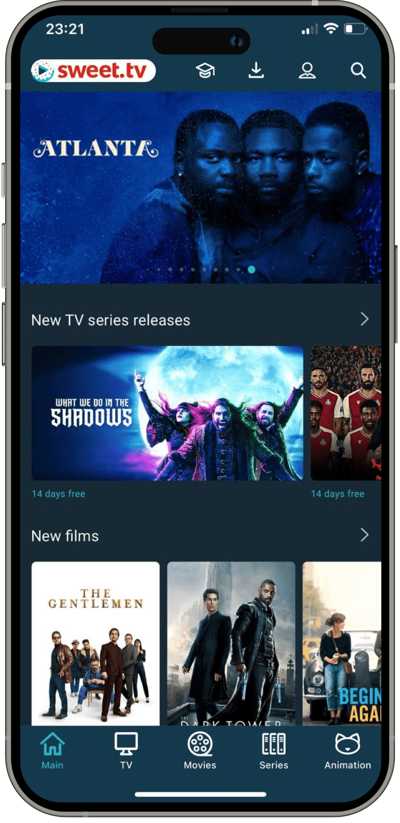
I led the redesign of their application to enhance the overall user experience.
improving the website Navigation
of crypto company
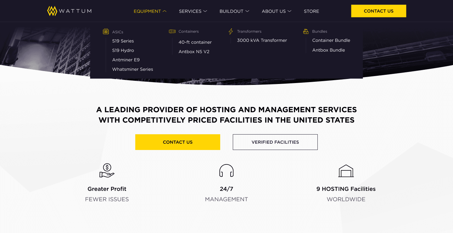
I helped the project redesign the site navigation, checkout process and also developed a design system
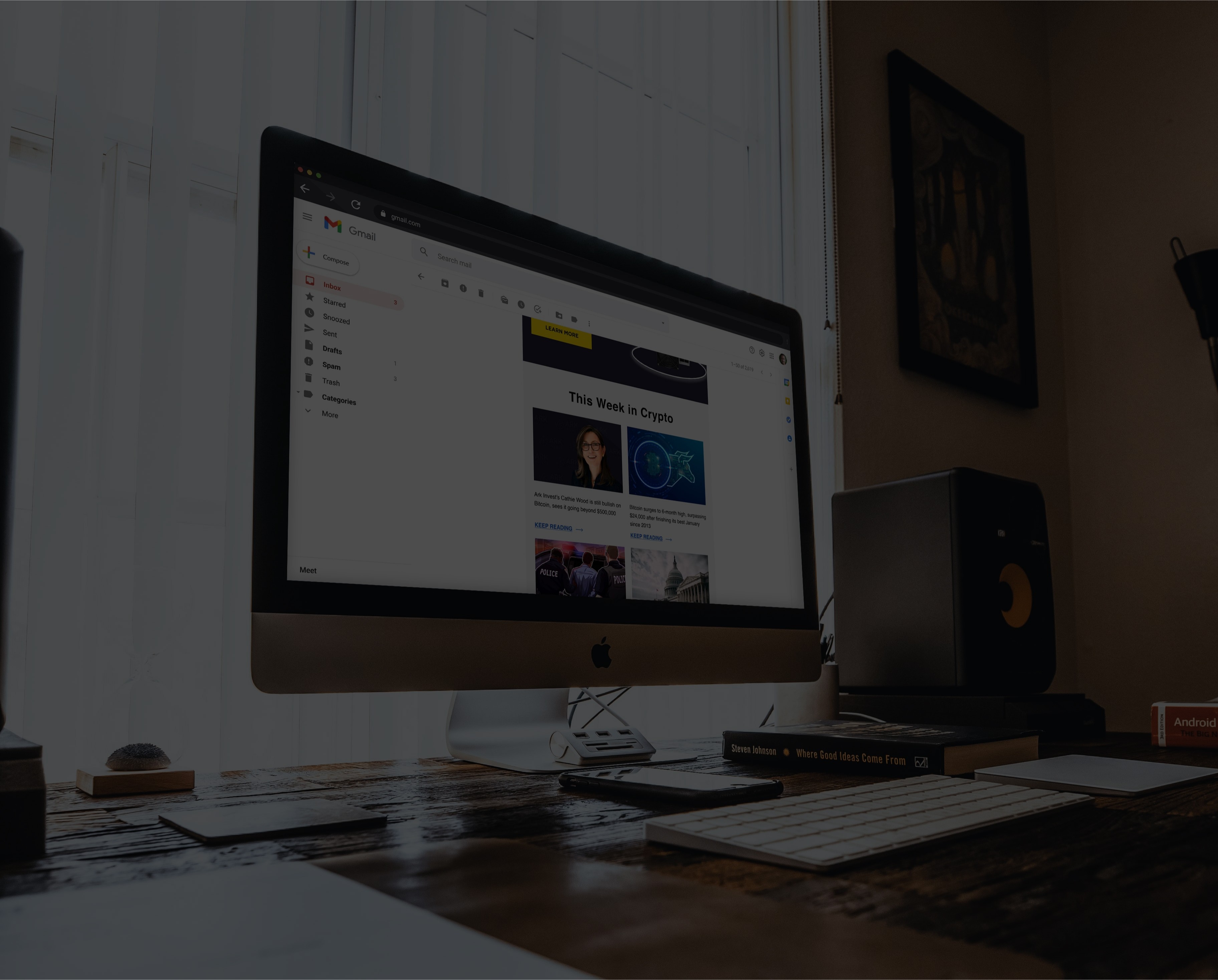
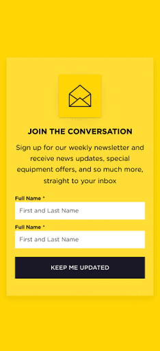
I helped the crypto project research and redesign the email campaigns to improve the Open Rate and Click Through Rate metrics.
