
Brand
Wattum
case study
Improving Email campaigns
Improving crypto Email campaigns
Summary
I helped the project research and redesign the email campaigns to improve the Open Rate and Click Through Rate metrics.
Responsibilities
UX Research
UI Design
Email Campaigns Launch
Research
Competitor Research
Email Marketing Best Practices
Email Marketing
Best Practices
Email Marketing
Best Practices
Email Design
Defining the Scope
Design System
Newsletter Sections
A/B Testing
Launch Campaign
Defining the Goal
Launch Campaigns
Results
Improving email performance amid falling Bitcoin
All email campaigns had already been running for some time and were producing some results. However, it was revealed that the main indicators of Open Rate and Click Through Rate were significantly lower than the average Benchmark indicators. The task was to find the weak spots in the emails, and what influences such low performance. I am very proud of the team members, consisting of three designers, including myself, and a developer, who managed to increase the above-mentioned indicators against the backdrop of an unprecedented fall in Bitcoin, which led to a general and total pause in the crypto industry.
All email campaigns had already been running for some time and were producing some results. However, it was revealed that the main indicators of Open Rate and Click Through Rate were significantly lower than the average Benchmark indicators. The task was to find the weak spots in the emails, and what influences such low performance. I am very proud of the team members, consisting of three designers, including myself, and a developer, who managed to increase the above-mentioned indicators against the backdrop of an unprecedented fall in Bitcoin, which led to a general and total pause in the crypto industry.
The challenge
The main challenge for the company was the fall of Bitcoin in the summer of 2022. We, being designers, could not influence the restoration of the market situation in any way, but we were able to improve the market performance of our email campaigns.
The main challenge for the company was the fall of Bitcoin in the summer of 2022. We, being designers, could not influence the restoration of the market situation in any way, but we were able to improve the market performance of our email campaigns.

Emily
Candidate

Sarah Müller
Hiring Manager

Nina Schneider
Association

Alice Smith
Administrator
Created Personas
Strategy
Newsletter for every client
The more the company was in the crypto movement, the more it reached clients of different levels. We determined who our emails were intended for and carefully conducted competitor research to identify best practices in the B2C and B2B segments. This way we were sure that each email was addressed to one or another client.
The more the company was in the crypto movement, the more it reached clients of different levels. We determined who our emails were intended for and carefully conducted competitor research to identify best practices in the B2C and B2B segments. This way we were sure that each email was addressed to one or another client.


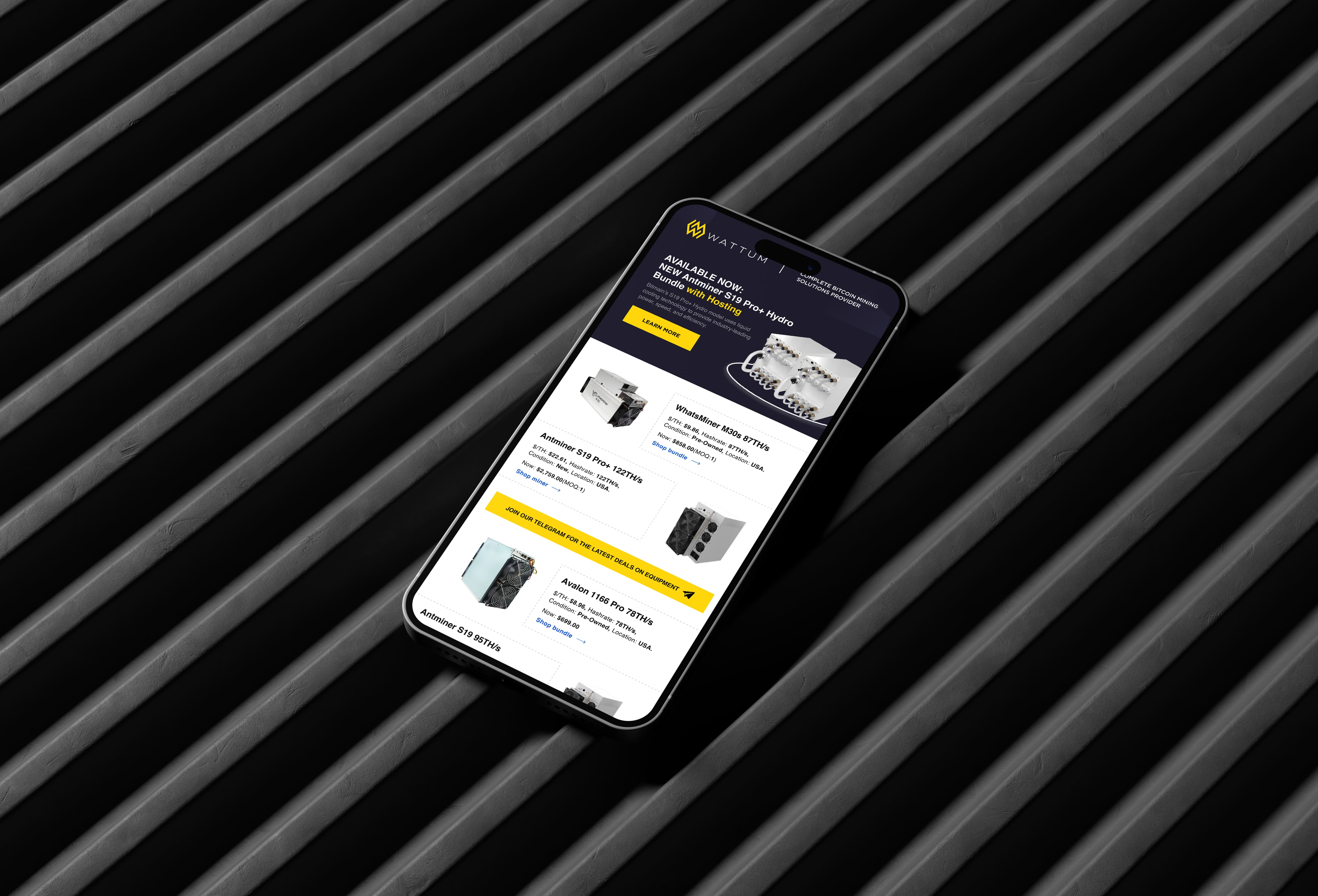

We decided that each email should have its own look, aimed at a particular customer segment. After working with the marketing department, we came to the conclusion that for B2C clients we will have offers starting from one unit per order. At the same time, we created bundles and wholesale offers for B2B clients.
We decided that each email should have its own look, aimed at a particular customer segment. After working with the marketing department, we came to the conclusion that for B2C clients we will have offers starting from one unit per order. At the same time, we created bundles and wholesale offers for B2B clients.


UX research
Emphasizing the problem statement
After analyzing our user surveys, I identified the following pain points that we would like to focus on:
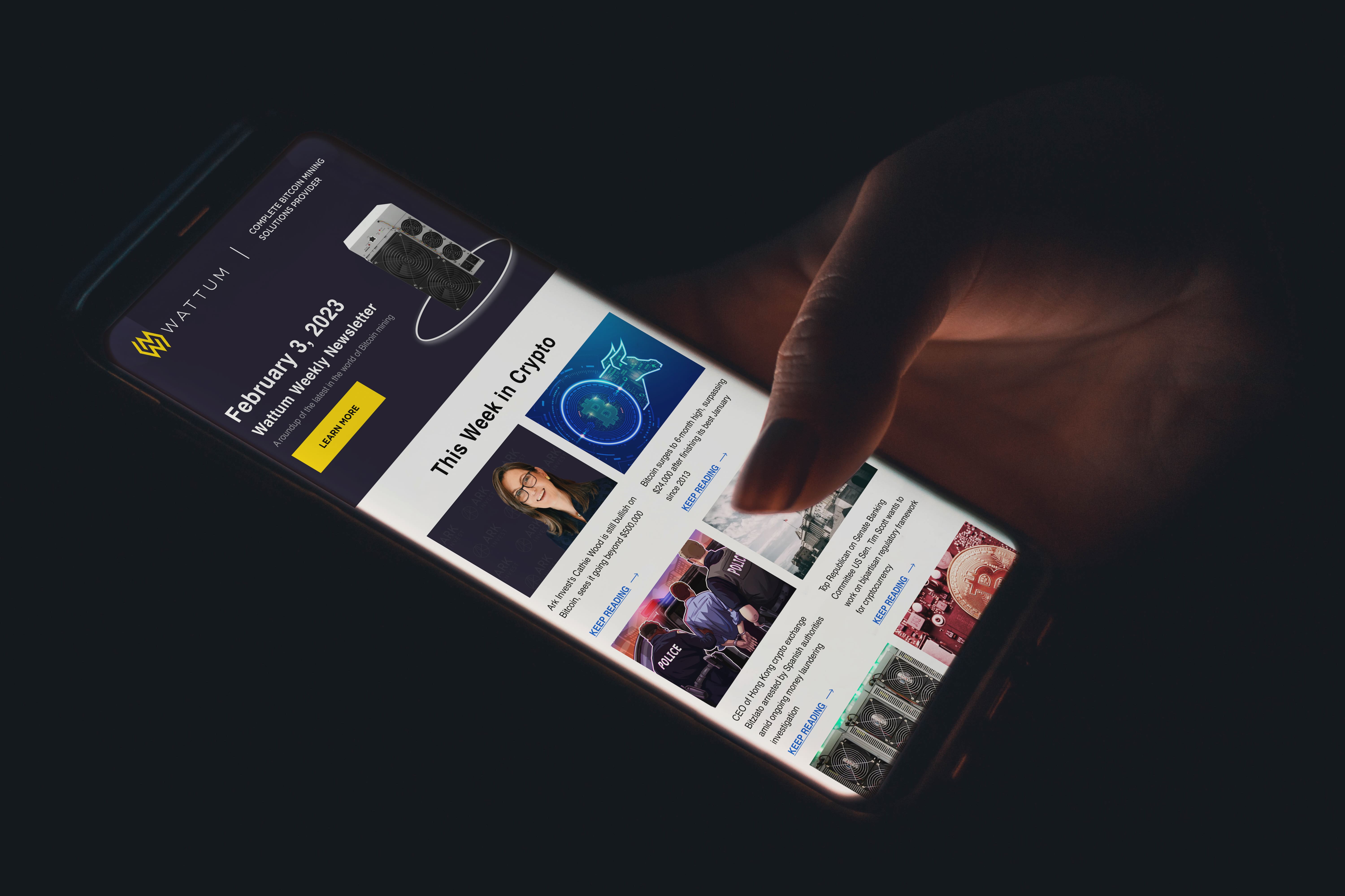
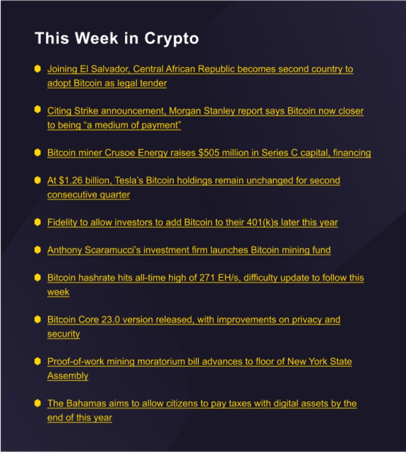
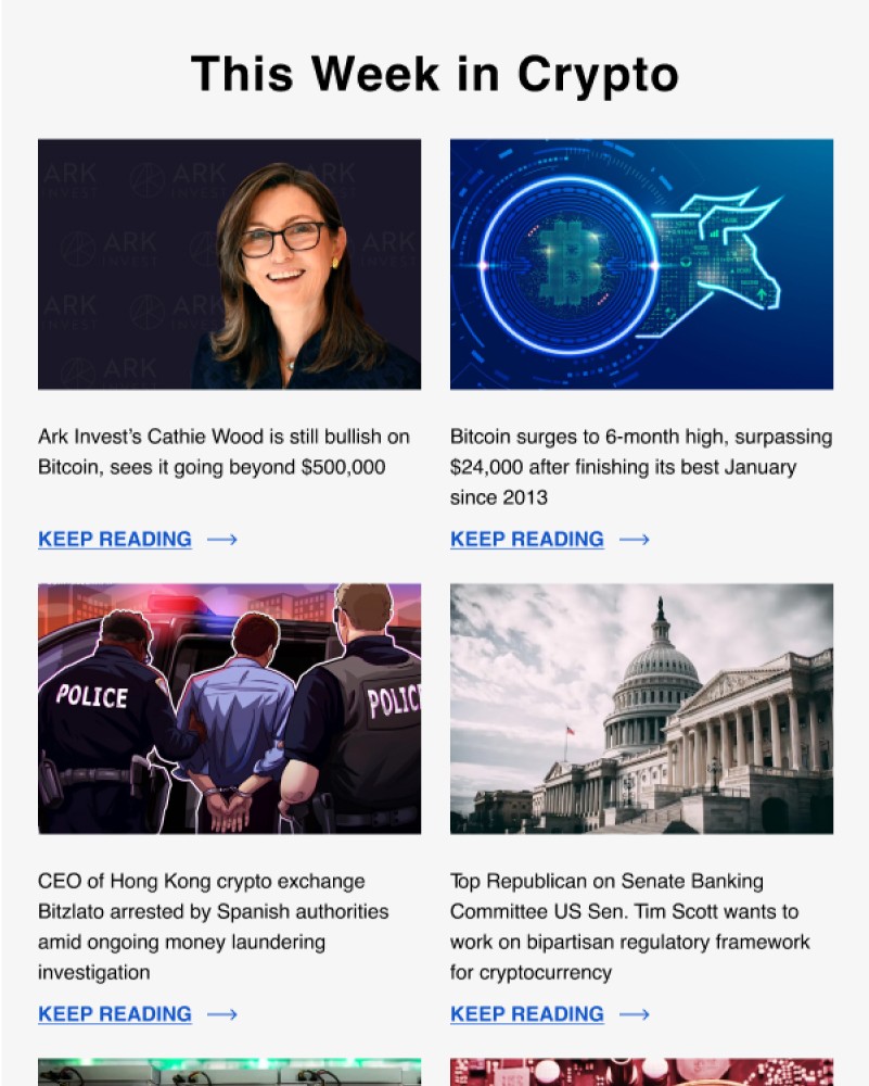
"This Week in Crypto"
Users find it difficult to interact with content that only contains links. The lack of visual content prevents users from clicking on links and reading articles in full, resulting in low engagement rates.
Solution -> Included visually appealing graphics and images showcasing the latest news and trends in the cryptocurrency world. The block was made more attractive and informative, as well as introducing links that were more visible and clickable by adding clear call-to-action buttons.
"Recommended articles"
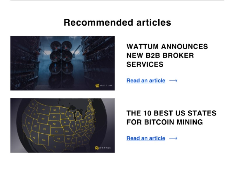
Long reads can be tedious and discourage readers from engaging with the content. Especially if the email begins with it.
Solution -> Instead of featuring only one long article, we now provide two short article summaries with only their names included in the newsletter. This allows readers to quickly scan the options and choose the article they are most interested in reading. added buttons to each article summary that lead to the full article on our website.
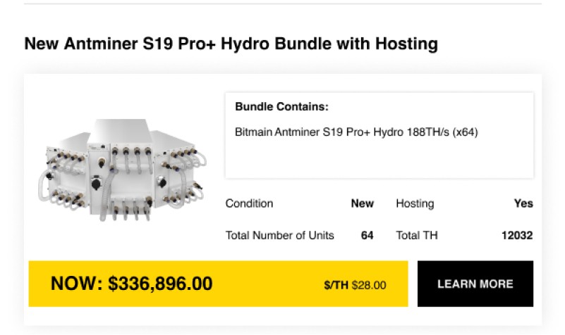
"Latest Equipment"
A huge amount of information on product cards. It's hard to find what to focus on. Inconsistent graphic forms and visual hierarchy.
Solution -> Reducing the amount of information displayed on each card and ensuring consistent graphic design, we have made it easier for readers to quickly scan and find the information they need.
"Call to action"
A banner with a call to action does not attract attention in any way and the user does not respond to it at all.
Solution -> Adding a visual supporting banner image that catches the reader's attention. Additionally, we have updated the design of the CTA button by using contrasting colors and bold typography to make it more prominent and increase its clickability.


"
Product Cards
Product Cards
"
Call to Action
Call to Action
"






"
This week in crypto
This week in crypto
Recommended Articles
Recommended Articles
"
After
After
Before
Before
After
After
After
After
Before
Before
Before
Before
After
After
Before
Before
"
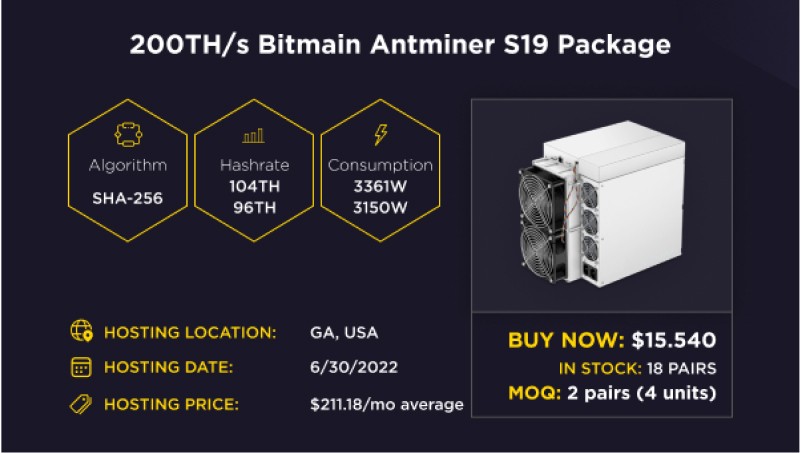
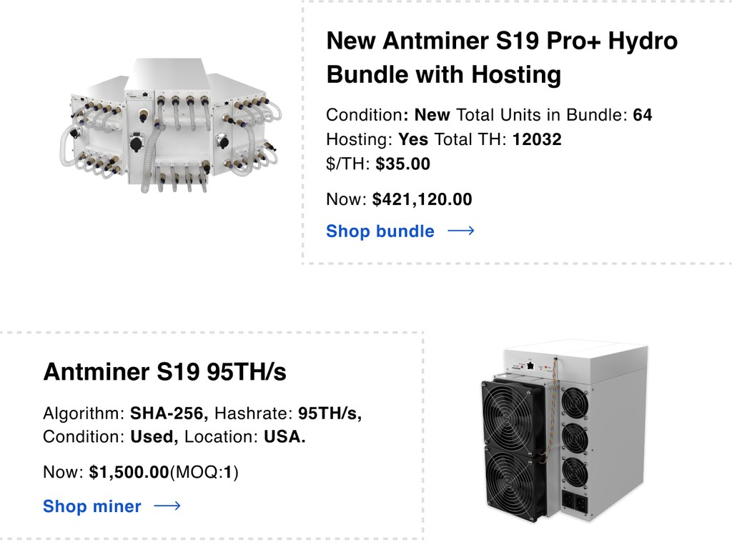
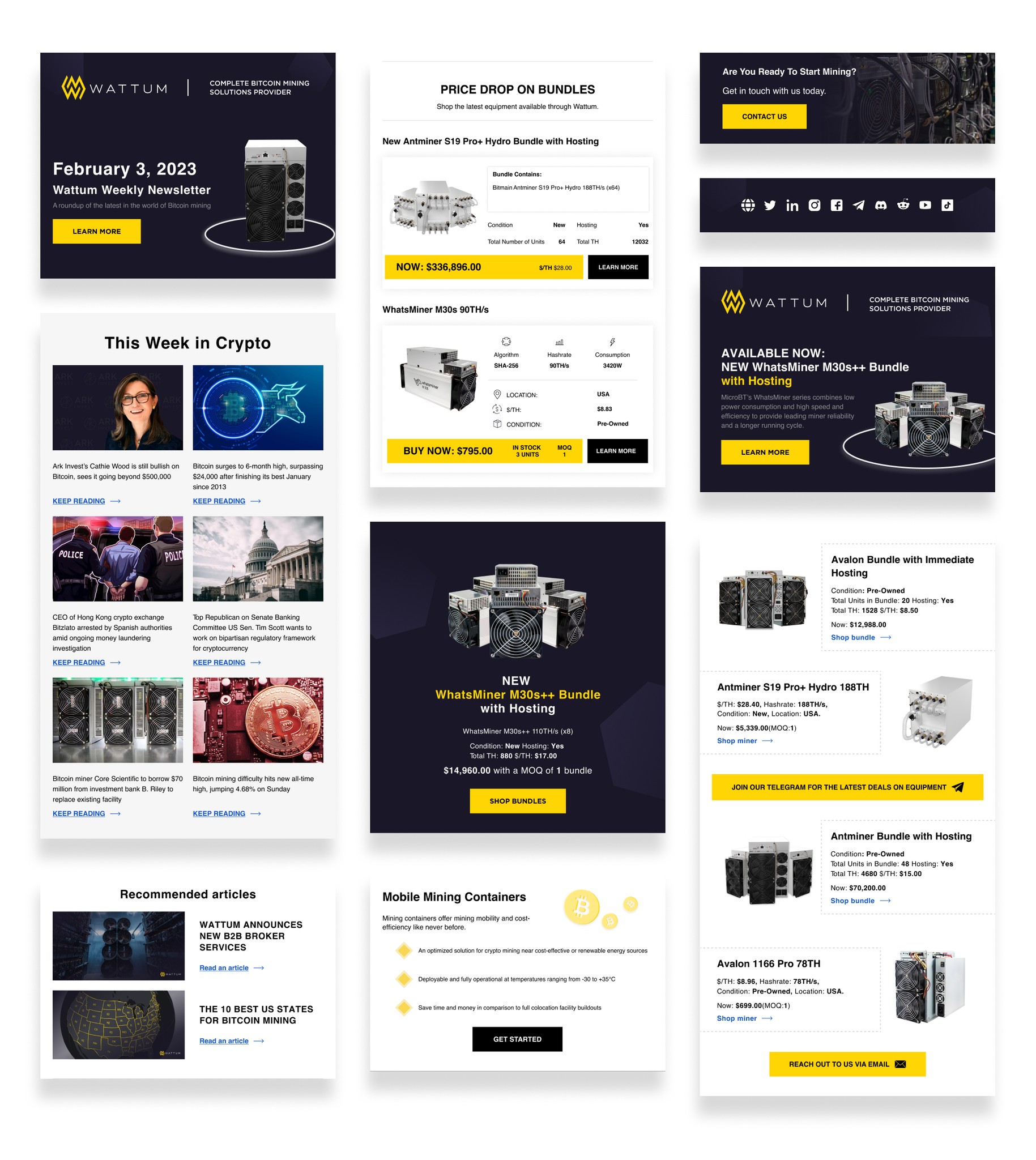
For B2B Clients, product cards were also redesigned, and the structure of the information presentation was changed.
For B2B Clients, product cards were also redesigned, and the structure of the information presentation was changed.




After
After
After
Before
Before
A/b Testing
Win in the dark mode
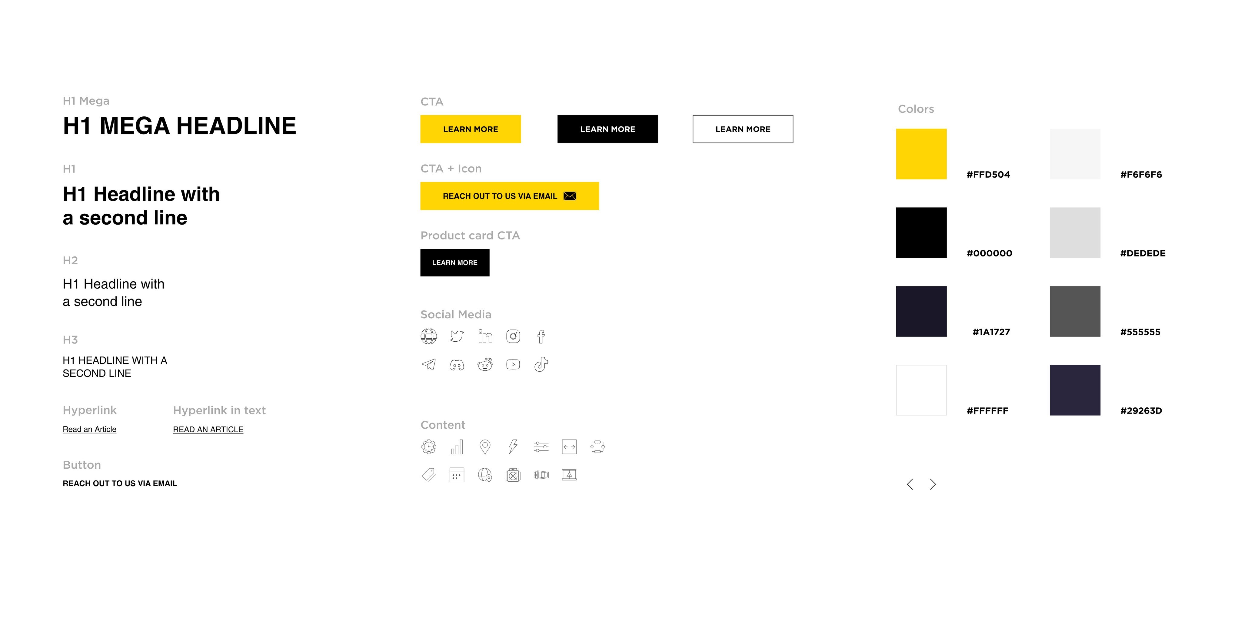
During the research and email redesign, we discovered a problem related to dark mode. It turned out that some email elements of the branded color were not displayed correctly. That is, the output color was distorted. Instead of the brand yellow, it turned out to be brown. The yellow color is the main corporate color. Which, of course, should be displayed correctly in all email platforms and devices.
Also, in the footer, where all the icon links to the company’s social networks were located, due to the dark color of the footer, it was displayed in black. That is, they were completely unreadable.
We conducted a lot of tests and manipulations with the design and eventually found a solution. For example, the icons were made with a black outline. And thus, the color indexing took over this outline, and the icon itself remained white. This is what was needed to display them correctly in the email footer. I am very grateful to Sergei Zlatov for putting a lot of effort into helping me dealing with the problem that appeared in the dark mode.




Storytelling
launching the email campaigns
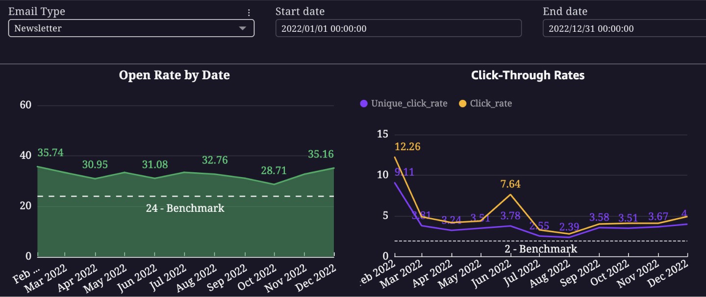
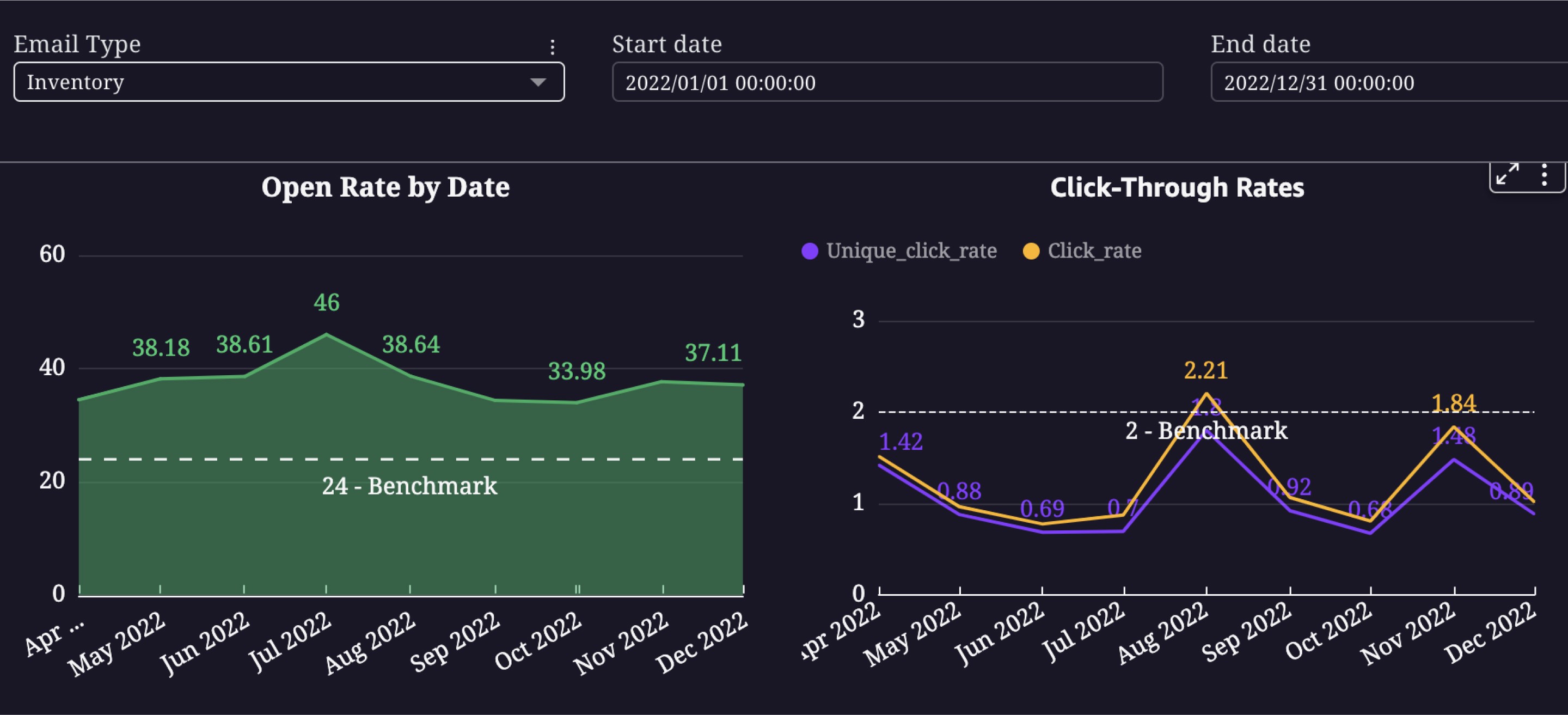
After research, redesign, and A/B testing, we received new results in terms of open rates and click-through rates in relation to the benchmark. And this is against the backdrop of the fact that Bitcoin just went down sharply.
After research, redesign, and A/B testing, we received new results in terms of open rates and click-through rates in relation to the benchmark. And this is against the backdrop of the fact that Bitcoin just went down sharply.




learnings
key Takeaways
Having completed work on email campaigns from Wattum, we were able to achieve better results. By analyzing the collected information along with best practices and talking to real users, we were able to improve key metrics and at the same time improve the user experience.
1. One of the significant results was the addition of more visual content to the emails, as well as a revision of the structure of the emails themselves.
2. We applied the best practice strategy from email marketing to our email campaigns and it brought results.
3. While working on the company’s emails, I created my design system, which overlapped with the design system of the main site, and helped speed up the creation of new letters and emails by up to 40%.
Selected projects
My selected
projects
UX Research, Redesign
Lead UX/UI Designer
Lead UX/ui Designer
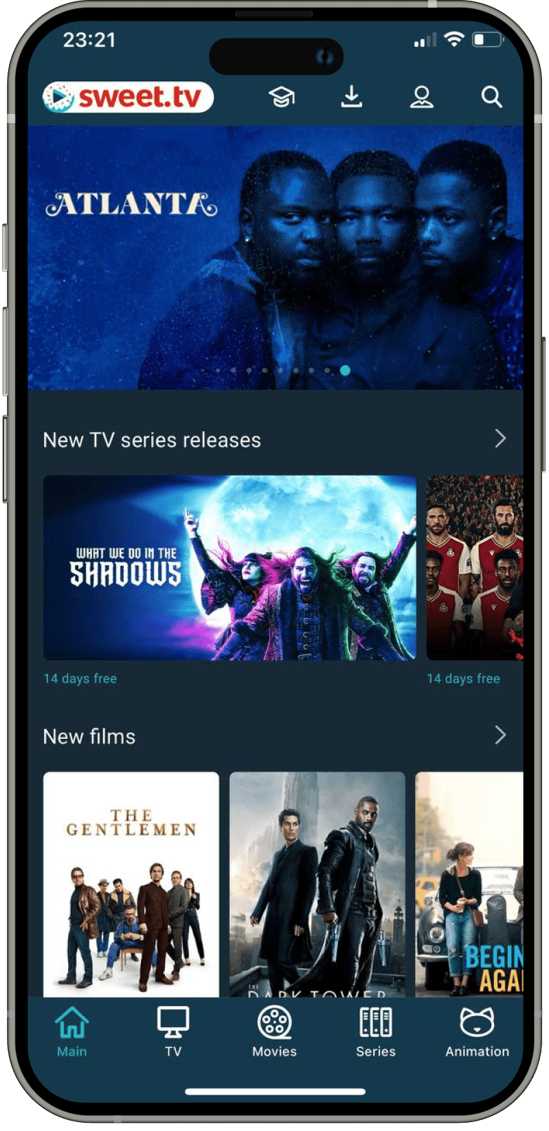
The sweet.tv Application Redesign
I led the redesign of their application to enhance the overall user experience.
UX / UI
Lead UX/ui Designer
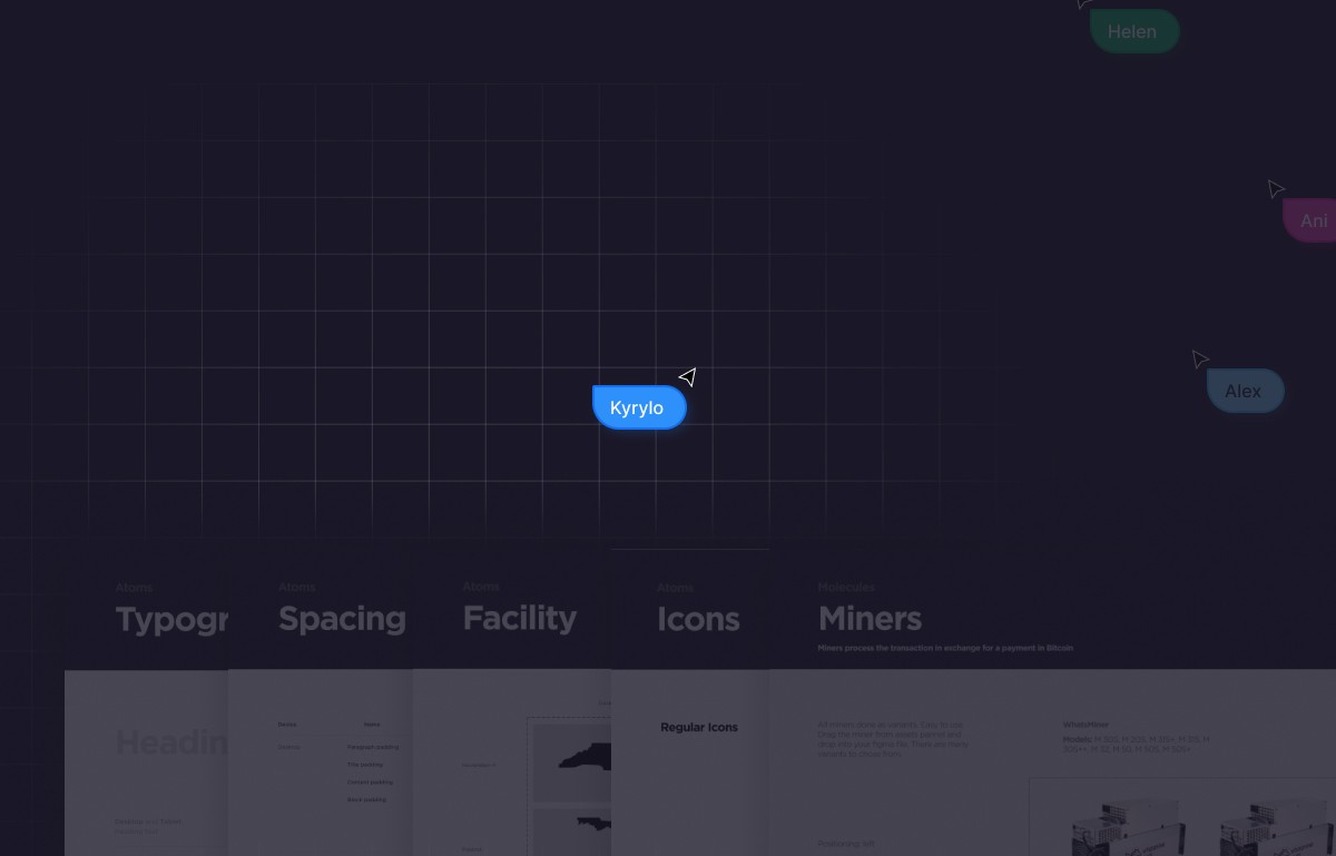
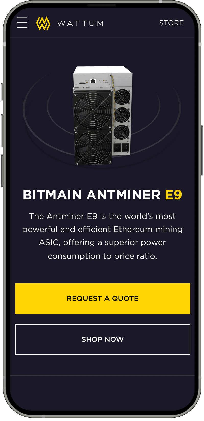
Behind the scenes of Crypto design system
I led the development of the design system following the atomic principle.
Lead UX/UI Designer
Behind the scenes of Crypto design system
I led the development of the design system following the atomic principle.


Lead UX Designer
Lead UX/UI Designer
Lead UX/ui Designer
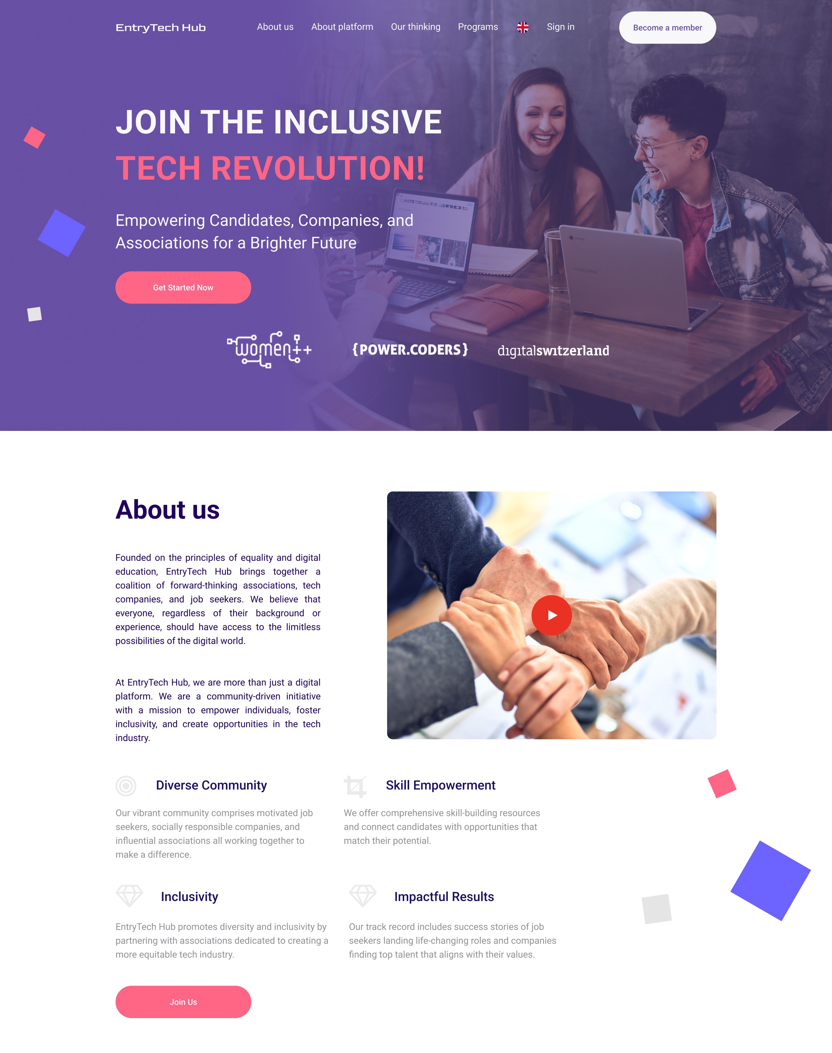
Crating recruiting platform.
empowering tech diversity
I did a research and designed a delivering of a working MVP tech solution for the Swiss market
I did a research and designed a delivering of
a working MVP tech solution for the Swiss market


UX/ui Designer
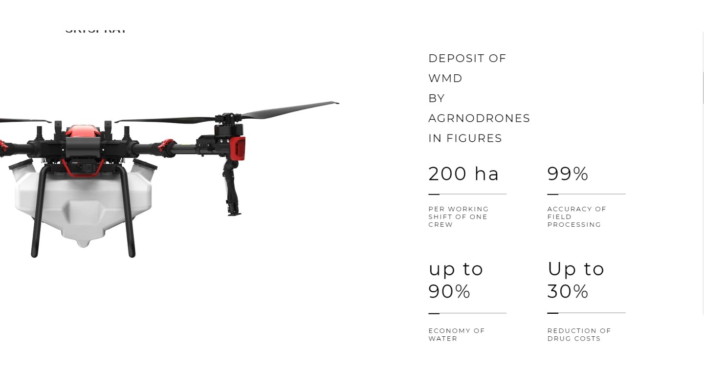
website for Ukrainian
Agri drones startup
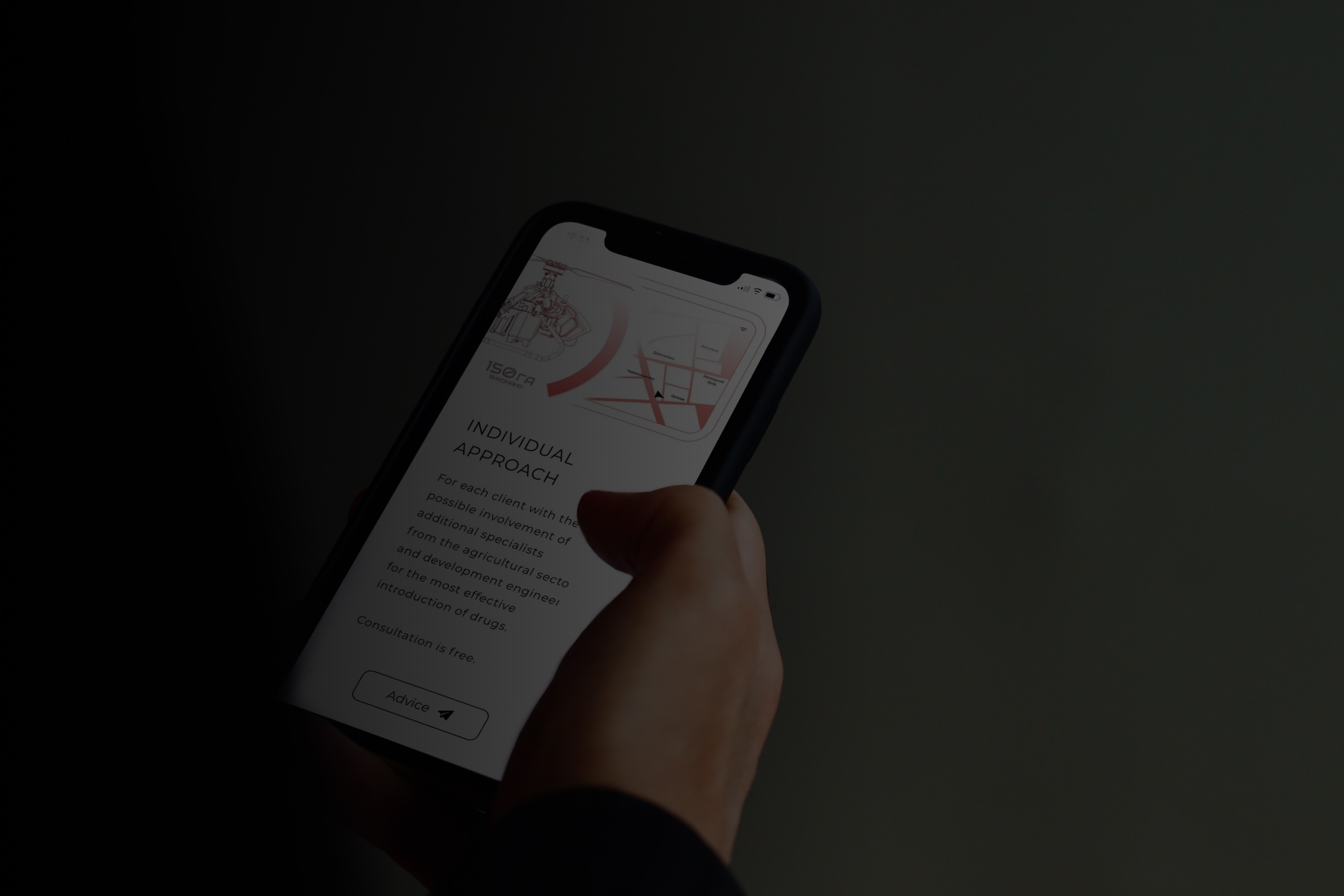
I helped a Ukrainian agricultural startup develop a dynamic and informative website for its agrodrone rental service


UX/UI Designer
website for Ukrainian
Agri drones startup
I helped a Ukrainian agricultural startup develop a dynamic and informative website for its agrodrone rental service


UX/ui Designer
website for Ukrainian
Agri drones startup
I helped a Ukrainian agricultural startup develop a dynamic and informative website for its agrodrone rental service


Selected projects

UX/UI Designer
UX/ui Designer
improving the website Navigation
of crypto company
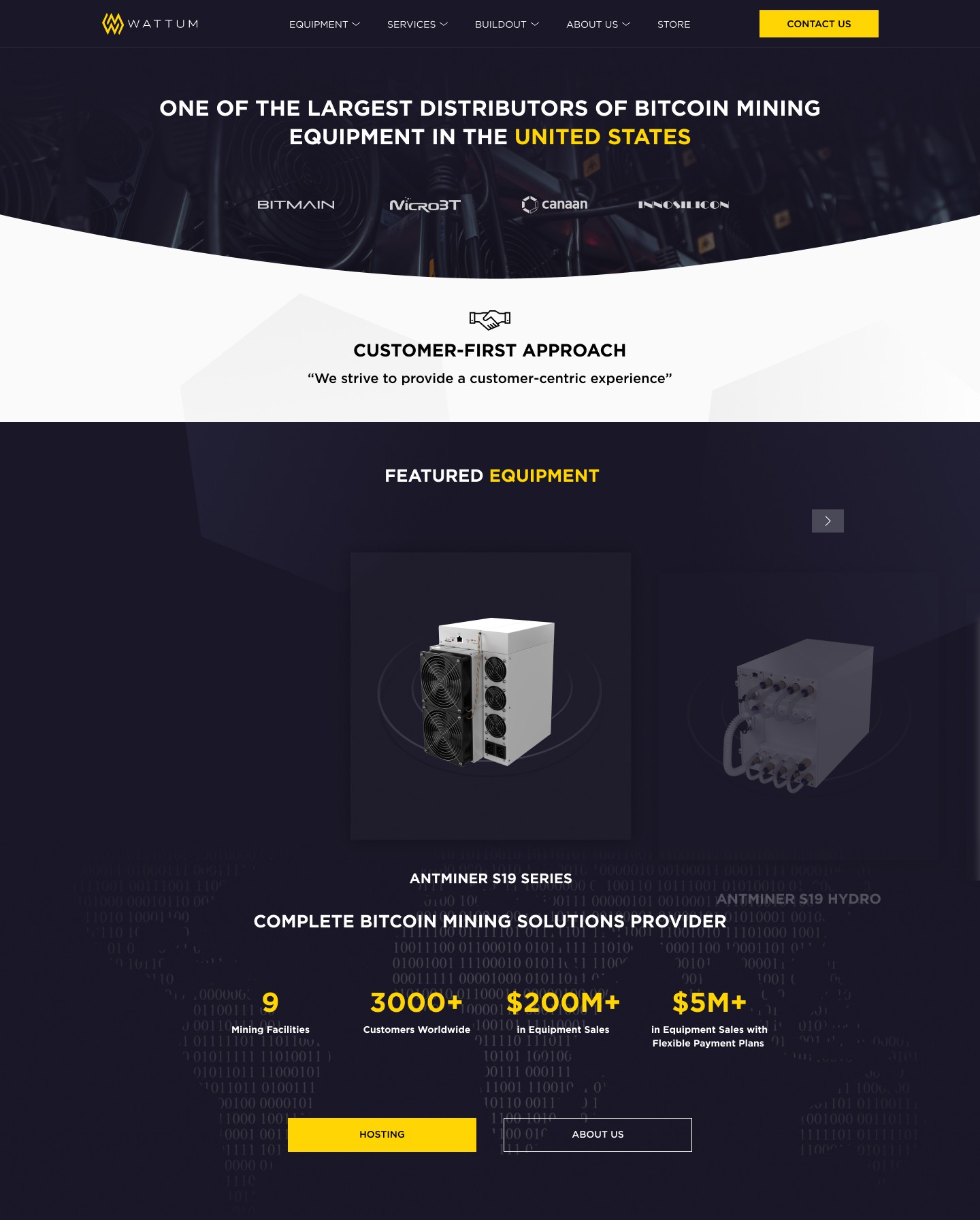
I helped the project redesign the site navigation, checkout process and also developed a design system

Get in Touch
Get in Touch
Have a nice project in mind? Looking for a partner to work together? Please, welcome to reach out to me,
and let’s create something stunning!
Have a nice project in mind? Looking for
a partner to work together? Please, welcome to reach out to me, and let’s create
something stunning!
Have a nice project in mind? Looking for a partner to work together? Please, welcome to reach out to me,
and let’s create something stunning!

Emma
Marketing manager at CryptoNews
Marketing manager at CryptoNews
Marketing manager
at CryptoNews
Stays updated on trends and developments.
Stays updated on trends
and developments.

Frank
Software engineer at BlockChain
Software engineer at BlockChain
Software engineer
at BlockChain
Creates and optimizes his own crypto solutions.
Creates and optimizes his
own crypto solutions.

Carol
CFO of SmallBiz
CFO of SmallBiz
CFO
of SmallBiz
Looking for a reliable service provider.
Looking for a reliable
service provider.

David
CEO of CoinUp
CEO of CoinUp
CEO
of CoinUp
Looking for a partner that can offer customized solutions and support.
Looking for a partner that can offer customized solutions and support.